This content originally appeared on Bits and Pieces – Medium and was authored by Eden Ella
Jumpstart your next React project with developer-friendly and user-friendly UI libraries: aesthetic, performance-optimized, and RSC-compatible.

Heading into 2025, selecting a React component library goes beyond aesthetics — you need libraries that meet rigorous standards for accessibility, internationalization, and performance.
In this post, we’ll explore 15 leading React component libraries that offer robust technology, ready-made templates, large community support, and performance-oriented features to help you deliver top-quality applications in the new year.
Before diving in, let’s take a look at a few concepts that have been around but are now more widely adopted across UI libraries.
Trends in UI component libraries
- Zero Runtime CSS-in-JS: build-time CSS extraction of CSS-in-JS declarations. It retains most of the advantages of CSS-in-JS, like excellent developer experience, while eliminating its performance penalties. Perhaps more importantly, it offers support for React Server Components (RSC), which aren’t able to make use of runtime style-injection mechanisms like useContext or useState to manipulate CSS (since React lifecycle mechanisms are not available for them). These solutions often rely on WyW-in-JS (“whatever you want in JS”).
- “Copy-Pasting” UI Components and “UI Blocks”: CLI tools for directly embedding the source code of UI components or UI component compositions into your project rather than installing npm packages. Shadcn UI is the most prominent player, but this can be seen in Chakra V3 as well. In addition to that, tools like Bit and Bit Platform have made every UI component, big or small, copy-able and are often used precisely for that.
- Semantic tokens: These design tokens make styling and theming much more manageable by replacing “raw” or “primitive” values with an abstract layer that represents design intent, such as roles and UI elements. For example, you might use tokens like body.text.default.
- CSS props (CSS variables): Instead of relying on library-specific styling solutions, CSS props allow for defining styles directly in CSS. This improves DevX as CSS props can be reviewed and manipulated from your browser’s dev tools. It also means there’s one less thing to learn about the library you’re using.
1. Material UI
+3.3M weekly downloads
Material UI is a comprehensive React component library that implements Google’s Material Design, providing accessible, responsive, and customizable components out of the box. It allows developers to quickly build production-ready UIs with advanced theming options, CSS utilities, and a strong design system. Material UI integrates seamlessly with popular frameworks and includes a suite of templates and design resources, making it a go-to choice for both rapid prototyping and scalable application development.

Material UI: React components that implement Material Design
Technologies and optimizations
MUI uses a combination of runtime and build-time CSS-in-JS.
• Emotion: The default runtime CSS-in-JS solution.
• Pigment CSS: An optional zero-runtime CSS-in-JS engine designed for improved performance and React Server Component compatibility.
In addition to its new “zero runtime” support, which includes plugins and configurations for popular bundlers, MUI has been built for tree-shaking by implementing an incredibly modular design.
Theming and styling
- Theming: Customize global themes using MUI’s theme provider to alter colors, typography, spacing, and more.
- Styled Components: The styled API from Emotion creates custom themeable components
- SX Prop: Apply styles directly to components using the sx prop with a concise syntax.
- CSS variables (CSS props): Optional.
Internationalization and accessibility
- RTL support: Automatically adjusts RTL language layout and component styling. This includes utility functions to manage RTL styling within custom components.
- WCAG Compliance: Adheres to WCAG 2.1 guidelines to ensure content is perceivable, operable, understandable, and robust.
- ARIA Attributes: Implements appropriate ARIA attributes in components.
- Keyboard Navigation: Ensures all interactive components are accessible via keyboard.
Resources and tools from the community
Copy-able MUI components on Bit Platform
Probably the easiest way to start your own custom Material UI library is by copying this collection of Material UI components and themes from Bit Platform (using Bit’s CLI tool). This gives you the freedom to customize and extend individual MUI components and quickly create custom themes.
When you’re ready, share your components to your own collection on Bit Platform. From there, they can be installed in other projects as regular packages.


Material UI Theme Creator

Templates, blocks, and starters
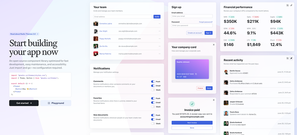
2. Radix UI Themes
+90K weekly downloads
Radix Themes is a pre-styled sibling of the Radix Primitives library which is designed for rapid development with minimal configuration.
It offers a collection of accessible, customizable components that integrate seamlessly into modern web applications. You can quickly install Radix Themes, import the global CSS file, and wrap your application with the Theme component to start building immediately.
The library provides various customization options, including theming, color schemes, and layout components, allowing developers to tailor the appearance and behavior of components to meet specific project requirements.
Technologies and optimizations
- Radix Primitives: An unstyled set of low-level, accessible (React) UI components
- CSS: Radix Themes are proud of their simple approach to styling using vanilla CSS
Theming and styling
- Theme Component: An out-of-the-box theme component that enables basic customization like accent colors, gray scales, scaling, etc.
- CSS props: Radix uses plain CSS files that you can directly edit to customize your theme. Since Radix Themes is all about minimal configurations and overhead, they also offer useful ‘color palette generator’

Internationalization and accessibility
Radix Themes is designed with accessibility and internationalization in mind:
• WCAG Compliance: Components adhere to WCAG guidelines, ensuring content is perceivable, operable, understandable, and robust.
• ARIA Attributes: Appropriate ARIA attributes are implemented across components to enhance accessibility for assistive technologies.
• Keyboard Navigation: All interactive components are accessible via keyboard, facilitating navigation for users relying on keyboard input.
• RTL Support: The library supports right-to-left (RTL) languages, automatically adjusting component layouts and styles to accommodate RTL text direction.
Resources and tools from the community
Copy-able Radix Themes components on Bit Platform
Use this collection of Radix Themes components to jumpstart your custom Radix Theme UI library.


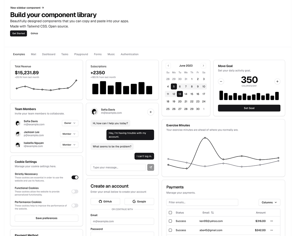
3. Shadcn UI
Shadcn UI is a collection of reusable, open-source components for developers to copy and paste into their projects. Unlike typical component libraries, it’s not installed as a dependency but serves as customizable code directly integrated into projects, supporting flexibility across frameworks.
Technologies and optimizations
Shadcn UI is designed for flexibility in styling and minimal runtime overhead.
- Tailwind CSS
- Radix Primitives: Built with Radix UI, ensuring accessibility and predictable behavior across components.
Theming and styling
To theme Shadcn UI components, you can choose between Tailwind CSS utility classes or CSS variables. Theming is defined in Shadcn’s configuration file.
Internationalization and accessibility
- Built-in RTL Support: Radix-based components support RTL languages out of the box, adjusting layout and styling automatically.
- WCAG Compliance: Aims to meet WCAG 2.1 standards, ensuring accessible and inclusive components.
- ARIA Attributes: Components include appropriate ARIA attributes by default for enhanced screen reader compatibility.
- Keyboard navigation: Ensures comprehensive keyboard accessibility, allowing all components to be navigable and usable without a mouse.
Resources and tools from the community
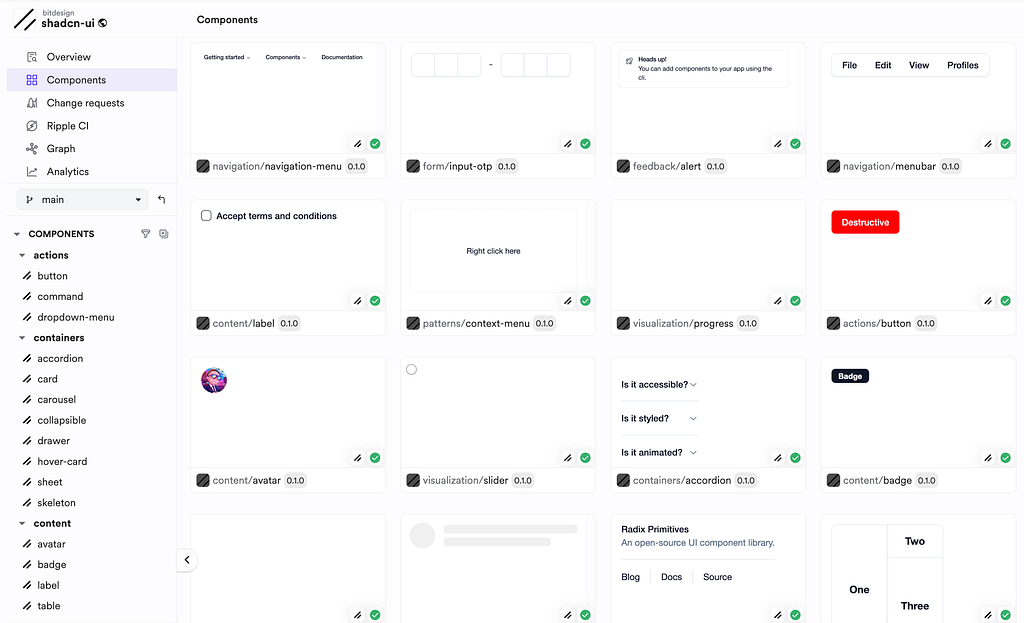
Shadcn UI components on Bit Platform
Use this collection of Shadcn UI components to jumpstart your custom Shadcn UI library.
Templates, blocks, and starters
The Shadcn UI official documentation provides a list of complex component compositions for common use cases. Copy the command at the top of each block and run it in your project to get the composition copied directly into your project:

ShadcnUI compositions can be generated using Vercel’s V0 AI coding assistant:
A premium collection of marketing blocks:
4. Chakra UI
Chakra UI is a React component library focused on building accessible, responsive web applications. It supports dark mode, integrates well with Next.js, and offers a customizable design system with semantic tokens and reusable components, allowing developers to create polished UIs efficiently.

Technologies and optimizations
Chakra UI employs a combination of runtime CSS-in-JS and design tokens to achieve efficient styling and theming:
• Emotion: for runtime CSS-in-JS styling.
• Performance Enhancements: Version 3 introduces an externalized styling engine, leading to faster style resolution and rendering times. Additionally, the migration to CSS animations has reduced dependencies and improved performance.
Theming and styling
Chakra UI offers robust theming and styling options to cater to diverse design requirements:
- Theming: Allows for comprehensive customization of global themes, including colors, typography, and spacing, through the createSystem function. (Chakra UI)
- Design Tokens: Implements semantic tokens to provide consistent theming across components, facilitating easy customization and ensuring uniformity. (Chakra UI)
- Styled Components: Provides a defineRecipe function to create custom, theme-aware components, promoting reusability and consistency. (Chakra UI)
• SX Prop: Enables inline styling directly within components using the sx prop, offering a concise and flexible approach to styling. (Chakra UI)
• CSS Variables: Leverages CSS variables for dynamic theming, allowing for responsive adjustments and efficient style management. (Chakra UI)
Internationalization and accessibility
Chakra UI is committed to delivering accessible and internationalized user interfaces:
• RTL Support: Automatically adjusts layouts and component styling for right-to-left languages, ensuring proper display and functionality. (Chakra UI)
• WCAG Compliance: Adheres to WCAG 2.1 guidelines, ensuring that components are perceivable, operable, understandable, and robust. (Chakra UI)
• ARIA Attributes: Implements appropriate ARIA attributes across components to enhance accessibility for assistive technologies. (Chakra UI)
• Keyboard Navigation: Ensures all interactive components are fully accessible via keyboard, facilitating seamless navigation for all users. (Chakra UI)
Resources and tools from the community
Copy-able Chakra UI components on Bit Platform
Use this collection of Chakra UI components to jumpstart your custom Radix Theme UI library.

5. Radix Primitives
Radix Primitives is an open-source React component library that provides unstyled, accessible components serving as foundational building blocks for high-quality web applications and design systems. Its unopinionated nature allows developers to apply custom styling and integrate seamlessly into various projects.

Technologies and optimizations
Radix Primitive components are unstyled themselves but are often used along with Tailwind.
Theming and Styling
Radix Primitives offers flexibility in theming and styling:
• Custom Styling: Radix Primitives allow you to apply styles using your preferred methods, such as CSS, CSS Modules, Tailwind, or CSS-in-JS libraries like Emotion or Styled Components.
Internationalization and accessibility
Radix Primitives is built with accessibility and internationalization in mind:
• RTL Support: Components automatically adjust to right-to-left (RTL) languages, ensuring proper layout and styling for internationalization.
• WCAG Compliance: Adheres to WCAG guidelines, ensuring content is perceivable, operable, understandable, and robust.
• ARIA Attributes: Implements appropriate ARIA attributes to enhance accessibility for users relying on assistive technologies.
• Keyboard Navigation: Ensures all interactive components are accessible via keyboard, facilitating navigation for users with diverse input methods.
Resources and tools from the community
Templates, blocks, and starters
Vercel lists an extensive list of Radix UI templates for common use-cases and technologies:
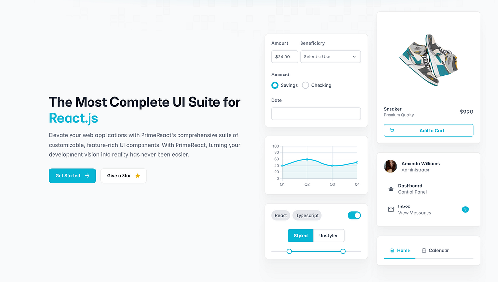
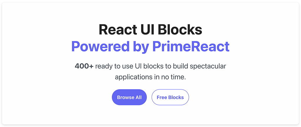
6. PrimeReact
PrimeReact is a comprehensive React UI library designed to streamline front-end development with over 80 customizable components. It supports both styled and unstyled modes, allowing integration with various CSS frameworks like Tailwind.
PrimeReact emphasizes accessibility, complying with WCAG standards and offering robust RTL and ARIA support. The library also provides pre-built themes (Material, Bootstrap) and 400+ UI blocks to expedite application building. Its design-agnostic infrastructure makes it adaptable to a wide range of applications and styles.
Technologies and optimizations
PrimeReact components support both styled and unstyled options, enabling integration with custom CSS libraries like Tailwind.
Theming and Styling
- Theming: Prebuilt themes (e.g., Material, Bootstrap) and custom theme creation.
- CSS Flexibility: Styled or unstyled modes for CSS freedom.
i18n and Accessibility
- WCAG Compliance: Meets WCAG standards.
- RTL and ARIA Support: Full RTL and ARIA attributes for accessibility.
Resources and tools from the community
Templates, blocks, and starters
Prime Blocks are pre-designed, ready-to-use UI components for React, built with the PrimeFlex CSS utility library and PrimeReact components. These blocks are designed for easy integration and customization by simply copying the code into a project. They support theming and interactive elements, allowing users to adapt blocks for responsive and interactive web designs.
7. Tailwind UI
Tailwind UI provides a collection of professionally designed, fully responsive UI components and templates for web projects, created by the makers of Tailwind CSS. It includes customizable components for applications, marketing sites, and e-commerce interfaces. Tailwind UI also offers production-ready templates built with frameworks like React and Next.js, designed to help developers build visually appealing and functional websites quickly.

Technologies and optimizations
Tailwind UI is built on top of Tailwind CSS, which uses a utility-first approach to styling. This means that instead of generating custom styles per component at runtime, Tailwind CSS generates a set of utility classes at build time, significantly reducing runtime overhead and improving performance.
- Tailwind CSS: Tailwind UI relies on pre-built utility classes, allowing for rapid styling without the need for inline styles or JavaScript-based styling solutions.
- Build-Time Optimization: With PurgeCSS (integrated in Tailwind), unused styles are removed during the build process, keeping the final CSS minimal and improving load times.
8. Next UI
NextUI is a React-based UI library designed to create accessible, customizable, and visually appealing interfaces. Built on Tailwind CSS and React Aria, it combines Tailwind’s styling with accessibility-focused components, offering pre-built elements with optimized, non-runtime CSS for high performance.
NextUI is TypeScript compatible, supports server-side rendering, and includes utility tools to manage Tailwind class conflicts. This library prioritizes ease of use and flexibility, allowing developers to rapidly build user-friendly interfaces with reliable keyboard navigation, theming options, and Framer Motion for enhanced animations.

Technologies and optimizations
- Tailwind CSS
- React Aria: a library focused on building accessible, style-free React components. It provides hooks and component APIs that ensure advanced accessibility features, internationalization, and support for various devices. React Aria components adapt seamlessly to mouse, touch, and keyboard interactions, aiming to create a consistent user experience across platforms.
Theming and Styling
- Tailwind Plugin: Easily customize themes or create new ones.
- Dark Mode: Supports automatic dark mode detection.
i18n and Accessibility
- WCAG Compliance: Follows accessibility guidelines with React Aria.
- RTL Support: Adjusts layout for RTL languages.
- Keyboard Navigation: Focus management and accessible interactions.
9. React-Bootstrap
React-Bootstrap is a reimagined version of Bootstrap built entirely with React components, removing dependencies like jQuery. It integrates with the Bootstrap CSS framework, ensuring compatibility and accessibility, making it a strong choice for React-based UI development.

Technologies and optimizations
React-Bootstrap leverages Bootstrap’s CSS classes directly, bypassing the need for CSS-in-JS and relying on standard CSS for styling. It is built to work seamlessly with any version of Bootstrap’s core CSS, enabling easy integration with custom Bootstrap themes.
- Bootstrap
- CSS: While Bootstrap itself is originally written in SCSS (Sass), the compiled CSS files are what React-Bootstrap uses and exposes to developers.
Theming and styling
- Custom variants and sizes: Create new styles by defining custom CSS classes (e.g., .btn-flat for a button).
- Prefixing components: base classes are prefixed via the bsPrefix prop on individual components or globally with ThemeProvider.
- Using SCSS: For extensive theme customizations, integrate Bootstrap’s SCSS directly to modify variables, then compile it into CSS for use.
Internationalization and accessibility
- RTL Support: Allows RTL layouts by configuring Bootstrap’s RTL version, although this may require additional CSS setup.
- WCAG Compliance: Aims to meet WCAG 2.1 guidelines to ensure a high standard of accessibility.
- ARIA and Accessibility: Uses ARIA attributes where necessary, and its components are designed with accessibility in mind to support screen readers and other assistive technologies.
- Keyboard Navigation: Built-in support for keyboard accessibility across all interactive elements, ensuring smooth navigation.
Conclusion
In conclusion, these top React component libraries for 2025 showcase how much flexibility, accessibility, and performance have advanced in the UI development space.
Choose a UI library to serve as the foundation for your own custom library. Then, use modern tools like Bit to handle your component dependencies, configurations, and documentation and share them with others quickly, efficiently, and with zero overhead.
Bit. Composable software platform.
Top 9 React Component Libraries for 2025 was originally published in Bits and Pieces on Medium, where people are continuing the conversation by highlighting and responding to this story.
This content originally appeared on Bits and Pieces – Medium and was authored by Eden Ella