This content originally appeared on Level Up Coding – Medium and was authored by Sonika | @Walmart | FrontEnd Developer | 10 Years
Most Important Interview Question Before Going For UI Interview
– Product Rating Component
– Shopping Cart UI
– Search Autocomplete Feature
– Product Image Gallery
– Pagination vs. Infinite Scroll
– Product Quick View Modal
– Product Filtering Sidebar
– Product Comparison Feature
– User Review and Feedback Form
For your practice:
– Checkout Process Redesign
– Personalised User Dashboard
Product Rating Component
Background: At Amazon, product ratings play a crucial role in influencing purchasing decisions. The star rating system helps users quickly assess the quality and feedback of a product.
Task: Design a React component called ProductRating that displays the average rating for a product and allows users to submit their own rating.
Requirements:
- The component should display the average rating as stars (e.g., ★★★☆☆ for a 3 out of 5 rating).
- Users should be able to hover over the stars and select a rating for the product.
- After selecting a rating, display a thank you message to the user.
- The component should handle and display potential errors (e.g., failed to submit the rating).
- Ensure the component is accessible to all users, including those using screen readers.
Bonus:
- Allow users to see a breakdown of ratings when they hover over the average rating (e.g., “25% 5-star, 50% 4-star…”).
- Implement a feature where users can write a review along with their rating.
Solution,
Implement a Star Rating Widget | Interview Preparation
JavaScript Implementation,
<!DOCTYPE html>
<html lang="en">
<head>
<meta charset="UTF-8" />
<meta name="viewport" content="width=device-width, initial-scale=1.0" />
<style>
.rating {
display: inline-block;
font-size: 24px;
cursor: pointer;
}
.rating .star {
color: gray;
}
.rating .star.active {
color: gold;
}
</style>
</head>
<body>
<div class="rating">
<span class="star">★</span>
<span class="star">★</span>
<span class="star">★</span>
<span class="star">★</span>
<span class="star">★</span>
</div>
<script>
// NodeList: [HTMLSpanElement, HTMLSpanElement, ....]
const stars = document.querySelectorAll('.star');
let selectedRating = 0;
stars.forEach((star, index) => {
star.addEventListener('click', () => {
selectedRating = index + 1;
updateStars();
});
});
function updateStars() {
stars.forEach((star, index) => {
if (index < selectedRating) {
star.classList.add('active');
} else {
star.classList.remove('active');
}
});
}
</script>
</body>
</html>
React Implementation,

import React, { useState } from 'react';
import './style.css';

const App = ({ initialAverageRating, onRate }) => {
  const [hoverRating, setHoverRating] = useState(0);
  const [selectedRating, setSelectedRating] = useState(0);
  const [error, setError] = useState(null);
  const [hasRated, setHasRated] = useState(false);
  const stars = Array(5).fill(0);

  const handleMouseOver = (rating) => {
    setHoverRating(rating);
  };

  const handleMouseOut = () => {
    setHoverRating(0);
  };

  const handleRate = async (rating) => {
    try {
      // Optionally, you can call an API here to submit the rating
      // await onRate(rating);
      setSelectedRating(rating);
      setHasRated(true);
    } catch (error) {
      setError('Failed to submit rating. Please try again.');
    }
  };

  const renderStars = () => {
    const effectiveRating = hasRated ? selectedRating : initialAverageRating;
    return stars.map((_, index) => (
      <span
        key={index}
        className={`star ${index < hoverRating ? 'hover' : ''} ${
          index < effectiveRating ? 'active' : ''
        }`}
        onMouseOver={() => !hasRated && handleMouseOver(index + 1)}
        onMouseOut={() => !hasRated && handleMouseOut()}
        onClick={() => !hasRated && handleRate(index + 1)}
        aria-label={`${index + 1} Star`}
        role="button"
        tabIndex={0}
      >
        ★
      </span>
    ));
  };

  return (
    <div>
      <div className="rating-container">{renderStars()}</div>
      {hasRated && <p>Thank you for your rating!</p>}
      {error && <p className="error">{error}</p>}
    </div>
  );
};
export default App;
.star {
cursor: pointer;
font-size: 2em;
color: lightgray;
transition: color 0.2s;
}
.star.active {
color: gold;
}
.star.hover {
color: gold;
}
.error {
color: red;
}Let’s Connect on Preplaced.com, Book Your Free Trial! Please clap for the story and follow me
Shopping Cart UI
Background: Amazon’s shopping cart is crucial for users to review products they’re interested in purchasing.
Task: Design a React component called ShoppingCart that displays products added to a cart and allows users to modify quantities or remove products.
Requirements:
- Display product name, price, and thumbnail in the cart.
- Allow users to increase or decrease the quantity of a product.
- Display the total price of the products in the cart.
- Provide a button to proceed to the checkout.
- Ensure that the cart is responsive and looks good on both desktop and mobile.
Bonus:
- Allow users to save items for later.
- Implement an “undo” feature when an item is removed from the cart.

Implementation,
- Create JSON, which is array of object:
// product list

[{
  id: 'unique-product-id',
  name: 'Product Name',
  price: 100.00,
  thumbnail: 'url-to-image.jpg',
  quantity: 1
},
{
  id: 'unique-product-id',
  name: 'Product Name',
  price: 100.00,
  thumbnail: 'url-to-image.jpg',
  quantity: 1
},

.....
.....
]
import React, { useState } from 'react';

function App() {
  const initial = [
    {
      id: 'unique-product-id-1',
      name: 'Product Name1',
      price: 100.0,
      thumbnail: 'url-to-image.jpg',
      quantity: 1,
    },
    {
      id: 'unique-product-id-2',
      name: 'Product Name2',
      price: 100.0,
      thumbnail: 'url-to-image.jpg',
      quantity: 1,
    },
  ];
  const [products, setProducts] = useState(initial); // This should ideally be fetched or passed as props.

  const updateQuantity = (productId, change) => {
    const updatedProducts = products.map((product) => {
      if (product.id === productId) {
        return { ...product, quantity: product.quantity + change };
      }
      return product;
    });

    setProducts(updatedProducts);
  };

  const removeProduct = (productId) => {
    const updatedProducts = products.filter(
      (product) => product.id !== productId
    );
    setProducts(updatedProducts);
  };

  const total = products.reduce(
    (acc, product) => acc + product.price * product.quantity,
    0
  );

  function Product({ product, updateQuantity, removeProduct }) {
    return (
      <div className="product">
        <div>{product.name}</div>
        <div>${product.price.toFixed(2)}</div>
        <div>
          <button onClick={() => updateQuantity(product.id, -1)}>-</button>
          {product.quantity}
          <button onClick={() => updateQuantity(product.id, 1)}>+</button>
        </div>
        <button onClick={() => removeProduct(product.id)}>Remove</button>
        <hr />
      </div>
    );
  }

  return (
    <div className="shopping-cart">
      {products.map((product) => (
        <Product
          key={product.id}
          product={product}
          updateQuantity={updateQuantity}
          removeProduct={removeProduct}
        />
      ))}
      <div>Total: ${total.toFixed(2)}</div>
      <button>Proceed to Checkout</button>
    </div>
  );
}

export default App;
Let’s Connect on Preplaced.com, Book Your Free Trial! Please clap for the story and follow me
Search Autocomplete Feature
Background: Search is integral to Amazon, allowing users to find and discover products.
Task: Design a React component SearchAutocomplete that suggests products as users type in a search bar.
Requirements:
- As users type, display a dropdown with product suggestions.
- Suggestions should be debounced to avoid excessive requests.
- Highlight the portion of the product name in the suggestions that matches the user’s query.
- Ensure accessibility for users relying on keyboard navigation or screen readers.
Bonus:
- Allow users to navigate the suggestions with arrow keys.
- Display product images next to the product name in the suggestions.
Solution,

Requirements:
1.As users type, display a dropdown with product suggestions.
<>
      <label htmlFor="search">Search: </label>
      <input
        type="text"
        id="search"
        ref={inputRef}
        aria-autocomplete="list"
        aria-controls="autocomplete-list"
        onChange={handleChange}
        onKeyDown={handleKeyDown}
        value={searchItem}
      />
      {list.length > 0 && (
        <ul id="autocomplete-list" role="listbox">
          {list.map((item, index) => (
            <li
              key={index}
              role="option"
              aria-selected={index === focusedIndex}
              onMouseEnter={() => setFocusedIndex(index)}
              onClick={() => {
                setSearchItem(item);
                setList([]);
                inputRef.current.focus();
              }}
              style={{
                background: index === focusedIndex ? '#e0e0e0' : undefined,
                cursor: 'pointer'
              }}
            >
              {highlightText(item, searchItem)}
            </li>
          ))}
        </ul>
      )}
    </>
  );
}

export default App;
In this updated code, the handleChange function calls the debounced version of fetchOrFilterList. This ensures that fetchOrFilterList is invoked with a delay after the user stops typing, thus implementing debouncing.
2. Suggestions should be debounced to avoid excessive requests.
const debounce = (callback, delay) => {
  let timeoutId;
  return (...args) => {
    if (timeoutId) {
      clearTimeout(timeoutId);
    }
    timeoutId = setTimeout(() => {
      callback(...args);
    }, delay);
  };
};


const fetchOrFilterList = debounce((searchTerm) => {
    fetch('https://helo.com')
      .then((response) => response.json())
      .then((data) => {
        // Assuming the API returns an array of product suggestions
        setList(data);
      })
      .catch(() => {
        if (searchTerm) {
          setList(config.filter(item => item.includes(searchTerm)));
        } else {
          setList([]);
        }
      });
  }, 300);
3. Highlight the portion of the product name in the suggestions that matches the user’s query.
const highlightText = (text, query) => {
    const startIndex = text.toLowerCase().indexOf(query.toLowerCase());
    if (startIndex === -1) return text;
    return (
      <>
        {text.slice(0, startIndex)}
        <strong style={{ background: 'yellow' }}>
          {text.slice(startIndex, startIndex + query.length)}
        </strong>
        {text.slice(startIndex + query.length)}
      </>
    );
  };
4. Ensure accessibility for users relying on keyboard navigation or screen readers.
5. Allow users to navigate the suggestions with arrow keys.
// Accessibility:


// Add on <li>...</li>
 aria-selected={index === focusedIndex}
 onMouseEnter={() => setFocusedIndex(index)}


// Add on <input>
aria-autocomplete="list"
aria-controls="autocomplete-list"
onKeyDown={handleKeyDown}


// Allow users to navigate the suggestions with arrow keys.
const handleKeyDown = (e) => {
    switch (e.key) {
      case 'ArrowDown':
        setFocusedIndex(prev => (prev + 1) % list.length);
        break;
      case 'ArrowUp':
        setFocusedIndex(prev => (prev - 1 + list.length) % list.length);
        break;
      case 'Escape':
        setList([]);
        break;
      case 'Enter':
        if (focusedIndex >= 0) {
          setSearchItem(list[focusedIndex]);
          setList([]);
        }
        break;
      default:
        break;
    }
  };
Implementation,
import React, { useState, useRef } from 'react';

const debounce = (callback, delay) => {
  let timeoutId;

  return (...args) => {
    if (timeoutId) {
      clearTimeout(timeoutId);
    }

    timeoutId = setTimeout(() => {
      callback(...args);
    }, delay);
  };

};

function App() {
  const config = [
    'memo',
    'mem',
    'memory',
    'son',
    'sonika',
    'sonikaaaa',
    'sonika mahe',
    'pra',
    'pranay',
    'memoooo',
  ];

  const [list, setList] = useState([]);
  const [searchItem, setSearchItem] = useState('');
  const [focusedIndex, setFocusedIndex] = useState(-1);

  const fetchOrFilterList = debounce((searchTerm) => {
    fetch('https://helo.com')
      .then((response) => response.json())
      .then((data) => {
        setList(data);
      })
      .catch(() => {
        if (searchTerm) {
          setList(config.filter((item) => item.includes(searchTerm)));
        } else {
          setList([]);
        }
      });
  }, 300);

  const handleChange = (e) => {
    const value = e.target.value;
    setSearchItem(value);
    fetchOrFilterList(value); // call the debounced function here
  };

  const highlightText = (text, query) => {
    const startIndex = text.toLowerCase().indexOf(query.toLowerCase());
    if (startIndex === -1) return text;
    return (
      <>
        {text.slice(0, startIndex)}
        <strong style={{ background: 'yellow' }}>
          {text.slice(startIndex, startIndex + query.length)}
        </strong>
        {text.slice(startIndex + query.length)}
      </>
    );
  };

  const handleKeyDown = (e) => {
    switch (e.key) {
      case 'ArrowDown':
        setFocusedIndex((prev) => (prev + 1) % list.length);
        break;
      case 'ArrowUp':
        setFocusedIndex((prev) => (prev - 1 + list.length) % list.length);
        break;
      case 'Escape':
        setList([]);
        break;
      case 'Enter':
        if (focusedIndex >= 0) {
          setSearchItem(list[focusedIndex]);
          setList([]);
        }
        break;
      default:
        break;
    }
  };

  return (
    <>
      <label htmlFor="search">Search: </label>
      <input
        type="text"
        id="search"
        aria-autocomplete="list"
        aria-controls="autocomplete-list"
        onChange={handleChange}
        onKeyDown={handleKeyDown}
        value={searchItem}
      />

      {list.length > 0 && (
        <ul id="autocomplete-list" role="listbox">
          {list.map((item, index) => (
            <li
              key={index}
              role="option"
              aria-selected={index === focusedIndex}
              onMouseEnter={() => setFocusedIndex(index)}
              onClick={() => {
                setSearchItem(item);
                setList([]);
              }}
              style={{
                background: index === focusedIndex ? '#e0e0e0' : undefined,
                cursor: 'pointer',
              }}
            >
              {highlightText(item, searchItem)}
            </li>
          ))}
        </ul>
      )}
    </>
  );
}

export default App;
Let’s Connect on Preplaced.com, Book Your Free Trial! Please clap for the story and follow me
Product Image Gallery
Background: High-quality product images are important for online shopping, helping users get a detailed view of products.
Task: Design a React component called ProductImageGallery that showcases product images.
Requirements:
- Display the main product image prominently.
- Show thumbnails of other product images, allowing users to click and view them.
- Implement zoom-in functionality on the main product image.
Bonus:
- Add a full-screen view option for the product images.
- Implement swipe gestures for mobile users to navigate through images.
Solution,
- Display the main product image prominently
2. Show thumbnails of other product images, allowing users to click and view them.

import React, { useState } from 'react';

function App() {

  const images = [
    'https://picsum.photos/id/20/200/300',
    'https://picsum.photos/id/10/200/300',
    'https://picsum.photos/id/80/200/300',
    'https://picsum.photos/id/60/200/300',
  ];
  const [selectedImage, setSelectedImage] = useState(images[0]);
  const handleSelected = (url) => {
    setSelectedImage(url);
  };

  return (
    <>
      <img src={selectedImage} width="320" height="320" />

      {images.map((url) => (
        <img
          src={url}
          width="100"
          height="100"
          style={{
            padding: '5px',
            ...(selectedImage === url && { border: '1px solid black' }),
          }}
          onClick={() => handleSelected(url)}
        />
      ))}
    </>
  );
}

export default App;
3. Implement zoom-in functionality on the main product image.
use CSS - style={isZoomed ? { transform: 'scale(2)' } : {}}


// Added Zoom In funcationality using CSS

import React, { useState } from 'react';

function App() {
  ......
  const [isZoomed, setIsZoomed] = useState(false);

  ....

  const handleZoomToggle = () => {
    setIsZoomed(!isZoomed);
  };

  return (
    <>
      ......
      <div onClick={handleZoomToggle}>
        <img
          src={selectedImage}
          width="320"
          height="320"
          style={isZoomed ? { transform: 'scale(2)' } : {}}
        />
      </div>
      ......
    </>
  );
}

export default App;
Bonus.1. Add a full-screen view option for the product images.
const [isFullscreen, setIsFullscreen] = useState(false);
.......

const toggleFullscreen = () => {
  if (!document.fullscreenElement) {
    document.documentElement.requestFullscreen(); // FOR FULLSCREEN
    setIsFullscreen(true);
  } else {
    if (document.exitFullscreen) {
      document.exitFullscreen();
      setIsFullscreen(false);
    }
  }
};

......
<div className="main-image" onClick={toggleFullscreen} style={isFullscreen ? {width: '100%', height: '100vh'} : {}}>
    <img src={currentImage} alt="Main product" />
</div>
BONUS.2. Implement swipe gestures for mobile users to navigate through images.
To implement swipe gestures for mobile users to navigate through images, we can utilize touch event handlers available in the browser: touchstart, touchmove, and touchend.
Here’s a step-by-step implementation for swipe gestures:
//  let's add states to capture the x position when the touch starts and
//  the x position when the touch ends:

const [startX, setStartX] = useState(null);
const [endX, setEndX] = useState(null);


// Add handlers for the touch events:
const handleTouchStart = (e) => {
    setStartX(e.touches[0].clientX);
  };

const handleTouchMove = (e) => {
  setEndX(e.touches[0].clientX);
};

const handleTouchEnd = () => {
  const currentIndex = images.indexOf(selectedImage);

  // Detect swipe direction
  if (startX - endX > 50 && currentIndex < images.length - 1) {
    setSelectedImage(images[currentIndex + 1]);
  } else if (endX - startX > 50 && currentIndex > 0) {
    setSelectedImage(images[currentIndex - 1]);
  }
};


// Add Event Handlers to the Image JSX:
<div
  // onClick={handleZoomToggle}
  // style={isFullscreen ? { width: '100%', height: '100vh' } : {}}
  onTouchStart={handleTouchStart}
  onTouchMove={handleTouchMove}
  onTouchEnd={handleTouchEnd}
>
  <img
    src={selectedImage}
    width="320"
    height="320"
    // onClick={toggleFullscreen}
    // style={isZoomed ? { transform: 'scale(2)' } : {}}
  />
</div>

Implementation,
import React, { useState } from 'react';

function App() {
  const images = [
    'https://picsum.photos/id/20/200/300',
    'https://picsum.photos/id/10/200/300',
    'https://picsum.photos/id/80/200/300',
  ];
  const [selectedImage, setSelectedImage] = useState(images[0]);
  const [isZoomed, setIsZoomed] = useState(false);
  const [isFullscreen, setIsFullscreen] = useState(false);
  const [startX, setStartX] = useState(null);
  const [endX, setEndX] = useState(null);

  const handleSelected = (url) => {
    setSelectedImage(url);
  };

  const handleZoomToggle = () => {
    setIsZoomed(!isZoomed);
  };

  const toggleFullscreen = () => {
    if (!document.fullscreenElement) {
      document.documentElement.requestFullscreen();
      setIsFullscreen(true);
    } else {
      if (document.exitFullscreen) {
        document.exitFullscreen();
        setIsFullscreen(false);
      }
    }
  };

  const handleTouchStart = (e) => {
    setStartX(e.touches[0].clientX);
  };

  const handleTouchMove = (e) => {
    setEndX(e.touches[0].clientX);
  };

  const handleTouchEnd = () => {
    const currentIndex = images.indexOf(selectedImage);

    // Detect swipe direction
    if (startX - endX > 50 && currentIndex < images.length - 1) {
      setSelectedImage(images[currentIndex + 1]);
    } else if (endX - startX > 50 && currentIndex > 0) {
      setSelectedImage(images[currentIndex - 1]);
    }
  };

  return (
    <>
      <div
        // onClick={handleZoomToggle}
        // style={isFullscreen ? { width: '100%', height: '100vh' } : {}}
        onTouchStart={handleTouchStart}
        onTouchMove={handleTouchMove}
        onTouchEnd={handleTouchEnd}
      >
        <img
          src={selectedImage}
          width="320"
          height="320"
          // onClick={toggleFullscreen}
          // style={isZoomed ? { transform: 'scale(2)' } : {}}
        />
      </div>

      {images.map((url) => (
        <img
          src={url}
          width="100"
          height="100"
          style={{
            padding: '5px',
            ...(selectedImage === url && { border: '1px solid black' }),
          }}
          onClick={() => handleSelected(url)}
        />
      ))}
    </>
  );
}

export default App;
Pagination vs. Infinite Scroll
Background: Browsing products is a core experience on Amazon. Efficiently loading and displaying products is crucial for user experience.
Task: Discuss the pros and cons of pagination versus infinite scroll for browsing products. Then, design a React component for your chosen method.
Requirements:
- For Pagination: Display a set number of products per page with controls to navigate to the next or previous page.
- For Infinite Scroll: Automatically load and append more products as the user scrolls down.
- Ensure the design is responsive and mobile-friendly.
Bonus:
- Implement a “Load More” button for the infinite scroll method.
- For Pagination, show numbered pages and allow jumping to specific pages.
Solution,
Pagination: Pros:
- Predictable and controlled loading of content.
- Easier for users to pick up where they left off.
- Better for SEO as search engines can crawl individual pages.
- Can be easier for users to compare products across pages.
Cons:
- Requires user action to see more content.
- Can lead to “click fatigue” if there are many pages.
Infinite Scroll: Pros:
- Smooth user experience without manual clicks.
- Encourages user engagement and time on site.
- Can lead to more content exposure and consumption.
Cons:
- Difficult for users to navigate or return to a specific point.
- Can be problematic for SEO without proper implementation.
- Can overwhelm users with too much content.
- Can slow down web performance if not handled correctly.
Implementation,
Check this Article In detail
React component for the “Infinite Scroll” method with a “Load More” button.
import React, { useState, useEffect } from 'react';

const PRODUCTS_PER_LOAD = 10;

const mockAPI = {
  fetchProducts: (start, limit) => {
    return new Promise((resolve) => {
      setTimeout(() => {
        resolve(
          Array.from({ length: limit }).map((_, idx) => ({
            id: start + idx,
            name: `Product ${start + idx}`,
            image: 'https://via.placeholder.com/150',
          }))
        );
      }, 1000);
    });
  },
};

// Throttle function
const throttle = (func, delay) => {
  let lastFunc;
  let lastRan;
  return function (...args) {
    const context = this;
    if (!lastRan) {
      func.apply(context, args);
      lastRan = Date.now();
    } else {
      clearTimeout(lastFunc);
      lastFunc = setTimeout(() => {
        if ((Date.now() - lastRan) >= delay) {
          func.apply(context, args);
          lastRan = Date.now();
        }
      }, delay - (Date.now() - lastRan));
    }
  };
};

function InfiniteScrollProducts() {
  const [products, setProducts] = useState([]);
  const [loading, setLoading] = useState(true);

  useEffect(() => {
    loadMoreProducts();
    const throttledHandleScroll = throttle(handleScroll, 200); // Throttling to every 200ms
    window.addEventListener('scroll', throttledHandleScroll);
    return () => {
      window.removeEventListener('scroll', throttledHandleScroll);
    };
  }, [products]);

  const loadMoreProducts = async () => {
    setLoading(true);
    const newProducts = await mockAPI.fetchProducts(
      products.length,
      PRODUCTS_PER_LOAD
    );
    setProducts((prev) => [...prev, ...newProducts]);
    setLoading(false);
  };

  const handleScroll = () => {
    if (window.innerHeight + window.scrollY >= document.body.offsetHeight - 500 && !loading) {
      loadMoreProducts();
    }
  };

  return (
    <div>
      <div className="products-grid">
        {products.map((product) => (
          <div key={product.id} className="product-card">
            <img src={product.image} alt={product.name} />
            <h3>{product.name}</h3>
          </div>
        ))}
      </div>
      {loading && <p>Loading...</p>}
    </div>
  );
}

export default InfiniteScrollProducts;
React Virtualization: Creating a custom virtualized component requires handling scrolling events, calculating visible items, and managing item positioning using absolute positioning. Here’s a simple version to get you started:
import React, { useState, useEffect, useRef } from 'react';

const PRODUCTS_PER_LOAD = 10;
const ITEM_HEIGHT = 150;

const mockAPI = {
  fetchProducts: (start, limit) => {
    return new Promise((resolve) => {
      setTimeout(() => {
        resolve(
          Array.from({ length: limit }).map((_, idx) => ({
            id: start + idx,
            name: `Product ${start + idx}`,
            image: 'https://via.placeholder.com/150',
          }))
        );
      }, 1000);
    });
  },
};

function InfiniteScrollProducts() {
  const [products, setProducts] = useState([]);
  const containerRef = useRef(null);
  const [visibleRange, setVisibleRange] = useState([0, 10]);

  useEffect(() => {
    loadMoreProducts();
  }, []);

  useEffect(() => {
    const handleScroll = () => {
      const startIndex = Math.floor(containerRef.current.scrollTop / ITEM_HEIGHT);
      const endIndex = Math.min(startIndex + 10, products.length);
      setVisibleRange([startIndex, endIndex]);

      if (endIndex === products.length) {
        loadMoreProducts();
      }
    };

    containerRef.current.addEventListener('scroll', handleScroll);
    return () => containerRef.current.removeEventListener('scroll', handleScroll);
  }, [products]);

  const loadMoreProducts = async () => {
    const newProducts = await mockAPI.fetchProducts(
      products.length,
      PRODUCTS_PER_LOAD
    );
    setProducts((prev) => [...prev, ...newProducts]);
  };

  return (
    <div ref={containerRef} style={{ height: '600px', overflow: 'auto', position: 'relative' }}>
      <div style={{ position: 'absolute', top: 0, width: '100%', height: `${products.length * ITEM_HEIGHT}px` }}>
        {products.slice(visibleRange[0], visibleRange[1]).map((product, index) => (
          <div key={product.id} style={{ top: `${(visibleRange[0] + index) * ITEM_HEIGHT}px`, position: 'absolute', width: '100%' }}>
            <img src={product.image} alt={product.name} />
            <h3>{product.name}</h3>
          </div>
        ))}
      </div>
    </div>
  );
}

export default InfiniteScrollProducts;
React component for displaying products with pagination.
import React, { useState, useEffect } from 'react';

const PRODUCTS_PER_PAGE = 10;

const mockAPI = {
    fetchProducts: (page, limit) => {
        return new Promise((resolve) => {
            setTimeout(() => {
                resolve(
                    Array.from({ length: limit }).map((_, idx) => ({
                        id: (page - 1) * limit + idx,
                        name: `Product ${(page - 1) * limit + idx}`,
                        image: 'https://via.placeholder.com/150',
                    }))
                );
            }, 1000);
        });
    },
    getTotalProducts: () => {
        // In a real scenario, this would return the total count of products from the backend.
        return 100; // assuming there are 100 products in total.
    },
};

function PaginationProducts() {
    const [products, setProducts] = useState([]);
    const [currentPage, setCurrentPage] = useState(1);
    const totalPages = Math.ceil(mockAPI.getTotalProducts() / PRODUCTS_PER_PAGE);

    useEffect(() => {
        (async () => {
            const data = await mockAPI.fetchProducts(currentPage, PRODUCTS_PER_PAGE);
            setProducts(data);
        })();
    }, [currentPage]);

    const goToPage = (page) => {
        setCurrentPage(page);
    };

    return (
        <div>
            <div className="products-grid">
                {products.map((product) => (
                    <div key={product.id} className="product-card">
                        <img src={product.image} alt={product.name} />
                        <h3>{product.name}</h3>
                    </div>
                ))}
            </div>
            <div className="pagination-controls">
                <button onClick={() => goToPage(currentPage - 1)} disabled={currentPage === 1}>
                    Previous
                </button>
                {Array.from({ length: totalPages }).map((_, idx) => (
                    <button key={idx} onClick={() => goToPage(idx + 1)}>
                        {idx + 1}
                    </button>
                ))}
                <button onClick={() => goToPage(currentPage + 1)} disabled={currentPage === totalPages}>
                    Next
                </button>
            </div>
        </div>
    );
}

export default PaginationProducts;

// Styles (for brevity, inline styles are not provided. You may want to use a CSS-in-JS solution or traditional CSS/SASS for styling).
Let’s Connect on Preplaced.com, Book Your Free Trial! Please clap for the story and follow me
Product Quick View Modal
Similar Problem: https://sonikamaheshwari067.medium.com/modal-component-react-javascript-ad0255c5ffff
Background: Users often want a quick overview of a product without navigating away from their current page.
Task: Design a React component that allows users to click on a product and view its details in a modal.
Requirements:
- The modal should display the product’s name, price, main image, and brief description.
- Implement a close button and ensure the modal can also be closed by clicking outside of it.
- Ensure accessibility, especially keyboard navigation.
Bonus:
- Implement a carousel within the modal to view multiple product images.
- Add an “Add to Cart” button within the modal.
Solution,
To create Modal, important CSS we need,
// Important things to keep in mind

/**
The color rgba(0, 0, 0, 0.5) is used to create a semi-transparent
black overlay. Here's a breakdown of the color value:

0, 0, 0: Represents the RGB values for black color.
(Red = 0, Green = 0, Blue = 0)

0.5: Represents the alpha (A) channel, which determines the opacity
of the color. 0.5 makes the color semi-transparent.

A value of 1 means fully opaque, and a value of 0 means fully transparent.
Here, 0.5 makes the color semi-transparent.

**/

<div
  style={{
    position: 'fixed',
    top: 0,
    left: 0,
    right: 0,
    bottom: 0,
    backgroundColor: 'rgba(0, 0, 0, 0.5)',// 0.5 makes the color semi-transparent
  }}
>

....
</div>


// Add CLOSE Button to top right ????
// position: 'absolute', top: '10px', right: '10px'
<button
 onClick={onClose}
 style={{ position: 'absolute', top: '10px', right: '10px' }}>
 Close
</button>


// Previous & Next Image button
{product.images.length > 1 && (
  <>
    <button onClick={() => setCurrentIndex((prev) => (prev - 1) % product.images.length)}>
      Previous
    </button>
    <button onClick={() => setCurrentIndex((prev) => (prev + 1) % product.images.length)}>
      Next
    </button>
  </>
)}

Implementation,
import React, { useState } from 'react';

import './style.css';

const App = () => {
  const [isModalOpen, setIsModalOpen] = useState(false);
  const sampleProduct = {
    name: 'Sample Product',
    price: '$100',
    description: 'This is a sample product description.',
    images: [
      'https://via.placeholder.com/150?text=Image+1',
      'https://via.placeholder.com/150?text=Image+2',
      'https://via.placeholder.com/150?text=Image+3',
    ],
  };

  const Modal = ({ product, show, onClose }) => {
    const [currentIndex, setCurrentIndex] = useState(0);

    return (
      <div
        style={{
          position: 'fixed',
          top: 0,
          left: 0,
          right: 0,
          bottom: 0,
          backgroundColor: 'rgba(0, 0, 0, 0.5)',
        }}
      >
        <div
          style={{
            position: 'relative',
            maxWidth: '400px',
            margin: '40px auto',
            padding: '10px',
            background: '#fff',
          }}
        >
          <button
            onClick={onClose}
            style={{ position: 'absolute', top: '10px', right: '10px' }}
          >
            OnClose
          </button>
          <div>
            <img
              src={product.images[currentIndex]}
              alt={product.name}
              style={{ width: '100%', paddingTop: '30px' }}
            />
          </div>
          <p>{product.description}</p>
          {product.images.length > 1 && (
            <>
              <button
                onClick={() =>
                  setCurrentIndex((prev) => (prev - 1) % product.images.length)
                }
              >
                Previous
              </button>
              <button
                onClick={() =>
                  setCurrentIndex((prev) => (prev + 1) % product.images.length)
                }
              >
                Next
              </button>
            </>
          )}

          <button
            style={{ position: 'absolute', bottom: '10px', right: '10px' }}
          >
            Add to cart
          </button>
        </div>
      </div>
    );
  };

  return (
    <div>
      <button onClick={() => setIsModalOpen(true)}>View Product Details</button>
      {isModalOpen && (
        <Modal
          product={sampleProduct}
          show={isModalOpen}
          onClose={() => setIsModalOpen(false)}
        />
      )}
    </div>
  );
};

export default App;
To ensure accessibility and keyboard navigation for the modal, we’ll need to consider the following aspects:
- Focus Management:
- When the modal opens, move the keyboard focus to the first interactive element in the modal.
- Trap focus within the modal so that the user can’t accidentally tab out of it.
- Return the focus to the triggering element when the modal closes.
2. Keyboard Interactions:
- Allow the user to close the modal by pressing the Escape key.
- Use the Tab key to navigate between interactive elements within the modal.
3. ARIA (Accessible Rich Internet Applications) Roles and Attributes:
- Use ARIA roles and attributes to communicate the appearance and disappearance of the modal to assistive technologies.
// Important things to keep in mind

<div role="dialog" aria-modal="true" aria-labelledby="product-title">


// add eventlistener 'keydown'
useEffect(() => {
  document.addEventListener('keydown', handleKeydown);
  return () => {
    document.removeEventListener('keydown', handleKeydown);
  };
}, []);


// handleKeyDown handles - Tab(move to next interacive element),
// Escape(close button)
const handleKeydown = (event) => {
    if (event.key === 'Escape') {
      close();
    }
    if (event.key === 'Tab') {
      if (event.shiftKey) {
        if (document.activeElement === firstInteractiveElement.current) {
          event.preventDefault();
          lastInteractiveElement.current.focus();
        }
      } else {
//Return the focus to the triggering element when the modal closes.
        if (document.activeElement === lastInteractiveElement.current) {
          event.preventDefault();
          firstInteractiveElement.current.focus();
        }
      }
    }
  };


// Trap focus within the modal so that the user can't accidentally tab out of it.
const firstInteractiveElement = useRef(null);
const lastInteractiveElement = useRef(null);


//Return the focus to the triggering element when the modal closes.
if (document.activeElement === lastInteractiveElement.current) {
  event.preventDefault();
  firstInteractiveElement.current.focus();
}
Implementation,
import React, { useState, useRef, useEffect } from 'react';
import './style.css';
const App = () => {
const [isModalOpen, setIsModalOpen] = useState(false);
const sampleProduct = {
name: 'Sample Product',
price: '$100',
description: 'This is a sample product description.',
images: [
'https://via.placeholder.com/150?text=Image+1',
'https://via.placeholder.com/150?text=Image+2',
'https://via.placeholder.com/150?text=Image+3',
],
};
const Modal = ({ product, show, onClose }) => {
const [currentIndex, setCurrentIndex] = useState(0);
const [isActive, setIsActive] = useState(true);
// Trap focus within the modal so that the user can't accidentally tab out of it.
const firstInteractiveElement = useRef(null);
const lastInteractiveElement = useRef(null);
useEffect(() => {
document.addEventListener('keydown', handleKeydown);
// When the modal opens, move the keyboard focus to the first interactive element in the modal.
firstInteractiveElement.current.focus();
return () => {
document.removeEventListener('keydown', handleKeydown);
};
}, []);
const handleKeydown = (event) => {
if (event.key === 'Escape') {
//Allow the user to close the modal by pressing the Escape key.
close();
}
if (event.key === 'Tab') {
//Use the Tab key to navigate between interactive elements within the modal.
if (event.shiftKey) {
console.log('---shiftKey-----');
if (document.activeElement === firstInteractiveElement.current) {
event.preventDefault();
lastInteractiveElement.current.focus();
}
} else {
//Return the focus to the triggering element when the modal closes.
console.log('----without shiftKey----');
if (document.activeElement === lastInteractiveElement.current) {
event.preventDefault();
firstInteractiveElement.current.focus();
}
}
}
};
const close = () => {
setIsActive(false);
onClose();
};
return (
<div
role="dialog"
aria-modal="true"
aria-labelledby="product-title"
style={{
position: 'fixed',
top: 0,
left: 0,
right: 0,
bottom: 0,
backgroundColor: 'rgba(0, 0, 0, 0.5)',
}}
>
<div
style={{
position: 'relative',
maxWidth: '400px',
margin: '40px auto',
padding: '10px',
background: '#fff',
}}
>
<button
onClick={close}
ref={firstInteractiveElement}
style={{ position: 'absolute', top: '10px', right: '10px' }}
>
OnClose
</button>
<div>
<img
src={product.images[currentIndex]}
alt={product.name}
style={{ width: '100%', paddingTop: '30px' }}
/>
</div>
<p>{product.description}</p>
{product.images.length > 1 && (
<>
<button
onClick={() =>
setCurrentIndex((prev) => (prev - 1) % product.images.length)
}
>
Previous
</button>
<button
onClick={() =>
setCurrentIndex((prev) => (prev + 1) % product.images.length)
}
>
Next
</button>
</>
)}
<button
ref={lastInteractiveElement}
style={{ position: 'absolute', bottom: '10px', right: '10px' }}
>
Add to cart
</button>
</div>
</div>
);
};
return (
<div>
<button onClick={() => setIsModalOpen(true)}>View Product Details</button>
{isModalOpen && (
<Modal
product={sampleProduct}
show={isModalOpen}
onClose={() => setIsModalOpen(false)}
/>
)}
</div>
);
};
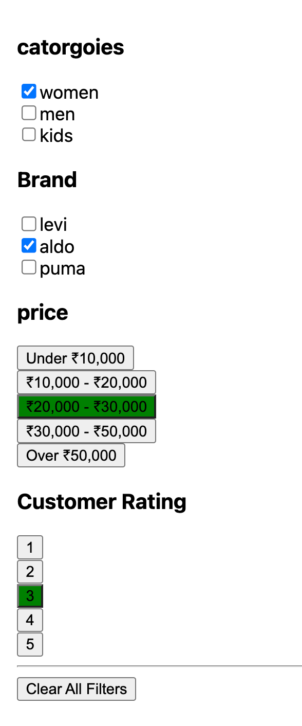
export default App;Product Filtering Sidebar
Background: With a vast array of products, users need efficient tools to filter results according to their preferences.
Task: Design a React component named FilterSidebar that offers filtering options for product listings.
Requirements:
- Display options to filter by categories, price range, brands, and customer ratings.
- Provide a visual indication of active filters.
- Include a button or option to clear all active filters.
- Ensure the design is responsive, converting the sidebar to a dropdown or modal on mobile devices.
Bonus:
- Implement an accordion-style collapsible design for each filtering section.
- Add a feature to display the number of products that match each filter criteria.
Solution,
– Display options to filter by categories, price range, brands, and customer ratings
– Include a button or option to clear all active filters.
– Implement an accordion-style collapsible design for each filtering section.
Implementation,
import React, { useState, useRef, useEffect } from 'react';

import './style.css';

const App = () => {
  const filters = [
    {
      id: 'catorgoies',
      name: 'catorgoies',
      type: 'checkbox',
      list: ['women', 'men', 'kids'],
      default: 'women',
    },
    {
      id: 'Brand',
      name: 'Brand',
      type: 'checkbox',
      list: ['levi', 'aldo', 'puma'],
      default: 'aldo',
    },
    {
      id: 'price',
      name: 'price',
      type: 'button',
      list: [
        'Under ₹10,000',
        '₹10,000 - ₹20,000',
        '₹20,000 - ₹30,000',
        '₹30,000 - ₹50,000',
        'Over ₹50,000',
      ],
      default: '₹10,000 - ₹20,000',
    },
    {
      name: 'Customer Rating',
      type: 'button',
      list: [1, 2, 3, 4, 5],
    },
  ];

  const [selectedOptions, setSelectedOptions] = useState({});

  const handleChange = (id, value) => {
    setSelectedOptions({
      ...selectedOptions,
      [id]: value,
    });
  };

  const RenderCheckBoxes = ({ filter }) => {
    return filter.list.map((value) => (
      <div>
        <input
          type="checkbox"
          value={value}
          checked={selectedOptions[filter.id] === value}
          onChange={() => handleChange(filter.id, value)}
        />
        <label>{value}</label>
      </div>
    ));
  };

  const RenderButtons = ({ filter }) => {
    return (
      <div>
        {filter.list.map((value) => (
          <div>
            <button
              onClick={() => handleChange(filter.id, value)}
              style={{
                backgroundColor:
                  selectedOptions[filter.id] === value ? 'green' : '',
              }}
            >
              {value}
            </button>
          </div>
        ))}
      </div>
    );
  };

  const renderFilter = (filter) => {
    if (filter.type === 'checkbox') {
      return <RenderCheckBoxes filter={filter} />;
    } else if (filter.type === 'button') {
      return <RenderButtons filter={filter} />;
    }
  };

  const EachFilter = ({ filter }) => {
    const [expanded, setExpanded] = useState(true);
    return (
      <div onClick={() => setExpanded(!expanded)}>
        <h3>{filter.name}</h3>
        <div style={{ display: expanded ? 'block' : 'none' }}>
          {renderFilter(filter)}
        </div>
      </div>
    );
  };

  const handleReset = () => {
    setSelectedOptions({});
  };

  return (
    <div>
      {filters.map((filter) => {
        return <EachFilter filter={filter} />;
      })}
      <hr />
      <button onClick={handleReset}> Clear All Filters</button>
    </div>
  );
};

export default App;
Add Accessibility, ARIA Roles & Labels:
- Added role="group" to the button filter group for context.
- Added aria-labelledby to associate each button group with a heading.
- Added aria-label to checkboxes for clarity.
- Used aria-pressed on the button to indicate the state of the filter.
- Added aria-expanded to the section toggles to inform the user if the section is expanded or not.
import React, { useState, useRef, useEffect } from 'react';
import './style.css';

const App = () => {
  ......

  const RenderCheckBoxes = ({ filter }) => {
    return filter.list.map((value, index) => (
      <div key={index}>
        <input
          type="checkbox"
          id={`${filter.id}-${value}`}
          value={value}
          checked={selectedOptions[filter.id] === value}
          onChange={() => handleChange(filter.id, value)}
        />
        <label htmlFor={`${filter.id}-${value}`}>{value}</label>
      </div>
    ));
  };

  const RenderButtons = ({ filter }) => {
    return (
      <div role="group" aria-labelledby={`${filter.id}-label`}>
        {filter.list.map((value, index) => (
          <div key={index}>
            <button
              onClick={() => handleChange(filter.id, value)}
              style={{
                backgroundColor:
                  selectedOptions[filter.id] === value ? 'green' : '',
              }}
              aria-pressed={selectedOptions[filter.id] === value}
            >
              {value}
            </button>
          </div>
        ))}
      </div>
    );
  };

  .....

  const EachFilter = ({ filter }) => {
    const [expanded, setExpanded] = useState(true);
    return (
      <div onClick={() => setExpanded(!expanded)} aria-expanded={expanded}>
        <h3>{filter.name}</h3>
        <div style={{ display: expanded ? 'block' : 'none' }}>
          {renderFilter(filter)}
        </div>
      </div>
    );
  };

  ....

  return (
    <div>
      {filters.map((filter) => {
        return <EachFilter filter={filter} />;
      })}
      <hr />
      <button onClick={handleReset}> Clear All Filters</button>
    </div>
  );
};

export default App;
Product Comparison Feature
Background: When shopping for electronics or appliances, users often want to compare specifications and prices of multiple products.
Task: Design a UI feature that allows users to select and compare products side by side.
Requirements:
- Users should be able to easily select products for comparison from a listing page.
- The comparison should visually align product features/specifications for easy scanning.
- Ensure a straightforward way for users to remove products from the comparison or add more.
- Design should be clean and not overwhelming, even when comparing several products.
Bonus:
- Allow users to highlight differences between the products.
- Implement a “share comparison” feature.
Solution,

Implementation,
import React, { useState } from 'react';

const productsData = [
  {
    id: 1,
    name: 'Product 1',
    features: {
      Size: 'Large',
      Color: 'Red',
      'Battery Life': '10 hours',
    },
  },
  {
    id: 2,
    name: 'Product 2',
    features: {
      Size: 'Medium',
      Color: 'Blue',
      'Battery Life': '8 hours',
    },
  },
  {
    id: 3,
    name: 'Product 3',
    features: {
      Size: 'Small',
      Color: 'Green',
      'Battery Life': '5 hours',
    },
  },
];

const ComparisonView = ({ products, onClose }) => {
  const features = Object.keys(products[0].features);

  return (
    <div>
      <button onClick={onClose}>Close Comparison</button>
      <table>
        <thead>
          <tr>
            <th>Feature/Specification</th>
            {products.map((product) => (
              <th key={product.id}>{product.name}</th>
            ))}
          </tr>
        </thead>
        <tbody>
          {features.map((feature) => (
            <tr key={feature}>
              <td>{feature}</td>
              {products.map((product) => (
                <td key={product.id}>{product.features[feature]}</td>
              ))}
            </tr>
          ))}
        </tbody>
      </table>
    </div>
  );
};

const CompareButton = ({ products }) => {
  const [selectedProductIds, setSelectedProductIds] = useState([]);
  const [showComparison, setShowComparison] = useState(false);

  const selectedProducts = products.filter((product) =>
    selectedProductIds.includes(product.id)
  );

  return (
    <div>
      {products.map((product) => (
        <div key={product.id}>
          {product.name}
          <input
            type="checkbox"
            checked={selectedProductIds.includes(product.id)}
            onChange={() => {
              if (selectedProductIds.includes(product.id)) {
                setSelectedProductIds((prevState) =>
                  prevState.filter((id) => id !== product.id)
                );
              } else {
                setSelectedProductIds((prevState) => [
                  ...prevState,
                  product.id,
                ]);
              }
            }}
          />
        </div>
      ))}
      <button onClick={() => setShowComparison(true)}>Compare</button>
      {showComparison && (
        <ComparisonView
          products={selectedProducts}
          onClose={() => setShowComparison(false)}
        />
      )}
    </div>
  );
};

const App = () => {
  return (
    <div>
      <CompareButton products={productsData} />
    </div>
  );
};

export default App;
User Review and Feedback Form
Background: User feedback and reviews provide invaluable insights and help build trust with potential buyers.
Task: Design a form where users can leave a review for a product and rate it.
Requirements:
- Include fields for a title, detailed review, and a star rating (1–5).
- Ensure that submitting the form provides clear feedback to the user (success or error messages).
- Make the form as concise as possible while capturing essential information.
- Prioritize accessibility, ensuring keyboard navigability and clear labels.
Bonus:
- Implement character counters for text areas.
- Provide immediate visual feedback on the star rating (e.g., highlighting stars as they’re hovered over).
Implementation,
– Include fields for a title, detailed review, and a star rating (1–5).
– Ensure that submitting the form provides clear feedback to the user (success or error messages).
import React, { useState } from 'react';

function App() {
  const ReviewForm = () => {
    const [formData, setFormData] = useState({
      title: '',
      detailedReview: '',
      rating: 1,
    });
    const [submitted, setSubmitted] = useState(false);

    const handleInputChange = (event) => {
      const { name, value } = event.target;
      setFormData((prevData) => ({
        ...prevData,
        [name]: value,
      }));
    };

    const handleSubmit = (event) => {
      event.preventDefault();
      // You can send this formData to your backend or handle as you wish
      console.log(formData);
      setSubmitted(true);
    };

    console.log(formData);

    return (
      <div>
        {submitted ? (
          <div>Your review has been submitted!</div>
        ) : (
          <form onSubmit={handleSubmit}>
            <div>
              <label>Title:</label>
              <input
                type="text"
                name="title"
                value={formData.title}
                onChange={handleInputChange}
                required
              />
            </div>
            <div>
              <label>Review:</label>
              <textarea
                name="detailedReview"
                value={formData.detailedReview}
                onChange={handleInputChange}
                required
              ></textarea>
            </div>
            <div>
              <label>Rating:</label>
              {[1, 2, 3, 4, 5].map((number) => (
                <span key={number}>
                  <input
                    type="radio"
                    name="rating"
                    value={number}
                    checked={formData.rating === number}
                    onChange={handleInputChange}
                  />
                  {number}
                </span>
              ))}
            </div>
            <button type="submit">Submit Review</button>
          </form>
        )}
      </div>
    );
  };
  return (
    <div className="App">
      <h1>Leave a Product Review</h1>
      <ReviewForm />
    </div>
  );
}

export default App;Implementation,
– Provide immediate visual feedback on the STAR Rating (e.g., highlighting stars as they’re hovered over)

// highlighting stars as they're hovered over -----> use

onMouseEnter={() => setHoverRating(number)}
onMouseLeave={() => setHoverRating(0)}
// Create STAR

<label
  htmlFor={`rating-${number}`}
  style={{
    fontSize: '24px',
    cursor: 'pointer',
    color: number <= (hoverRating || rating) ? 'gold' : '#ddd',
  }}
>
 ★
</label>
// Rating Component

import React, { useState } from 'react';

const Rating = ({ rating, onRatingChange }) => {
  const [hoverRating, setHoverRating] = useState(0);

  return (
    <fieldset style={{ border: '1px solid #ccc', padding: '10px', marginBottom: '10px' }}>
      <legend>Rating:</legend>
      {[1, 2, 3, 4, 5].map((number) => (
        <span
          key={number}
          onMouseEnter={() => setHoverRating(number)}
          onMouseLeave={() => setHoverRating(0)}
          style={{ marginRight: '5px' }}
        >
          <input
            type="radio"
            className="ratingRadio"
            id={`rating-${number}`}
            name="rating"
            value={number}
            checked={formData.rating === number}
            onChange={handleInputChange}
            style={{ display: 'none' }}
          />
          <label
            htmlFor={`rating-${number}`}
            style={{
              fontSize: '24px',
              cursor: 'pointer',
              color: number <= (hoverRating || rating) ? 'gold' : '#ddd',
            }}
          >
            ★
          </label>
        </span>
      ))}
    </fieldset>
  );
};

export default Rating;
Checkout Process Redesign
Background: A streamlined and user-friendly checkout process can significantly reduce cart abandonment rates.
Task: Redesign the checkout process for an e-commerce site to minimize steps and improve user experience.
Requirements:
- Include essential fields like shipping address, payment details, and order summary.
- Design with the goal of reducing cart abandonment. Every step and field should be justified.
- Consider how to handle errors or incomplete fields.
- Ensure that security and privacy are visually emphasized, especially around payment details.
Bonus:
- Implement a progress indicator showing the user’s current step in the checkout process.
- Allow for guest checkout vs. member checkout and illustrate the benefits of each.
Personalized User Dashboard
Background: A personalized dashboard can enhance user engagement and offer tailored shopping suggestions.
Task: Design a user dashboard for returning shoppers that showcases personalized content.
Requirements:
- Display personalized greetings and content based on the user’s past behavior.
- Include sections like “Recently Viewed Products”, “Recommended For You”, and “Order History”.
- Ensure the design is clean, intuitive, and encourages exploration.
- Think about how to make the dashboard useful but not overly cluttered.
Bonus:
- Include a feature where users can set their own preferences or interests to further refine recommendations.
- Design a notification or highlight for any new deals or discounts since the user’s last visit.
Thanks for reading
- Let’s Connect on Preplaced.com, Book Your Free Trial!
- Please clap for the story and follow me
 View more content on Coding and System Design Interviews
 Follow me: LinkedIn!
I know there would always be something to improve. Please feel free to share your thoughts
FrontEnd Build UI using React | Most Important Interview Question was originally published in Level Up Coding on Medium, where people are continuing the conversation by highlighting and responding to this story.
This content originally appeared on Level Up Coding – Medium and was authored by Sonika | @Walmart | FrontEnd Developer | 10 Years