This content originally appeared on Telerik Blogs and was authored by Jonathan Gamble
Creating shapes in HTML has gotten easier with Tailwind and SVG. Let’s take a look!
If you want to create some cool shapes in HTML, you might ask yourself how to do it and what to use. In CSS, creating these shapes has gotten easier, but now you can create actual SVG images that scale with ease.
Let’s take some common use cases so you can create your own. I will only be covering Tailwind and not regular CSS—however, I have added some Tailwind plugins for a few of the shapes.
For these SVG examples, I’m using a standard svg with the least necessary code. There is a width and height and no viewBox for simplicity.
<svg xmlns="http://www.w3.org/2000/svg" width="100" height="100">
...
</svg>
Rectangle

A rectangle is the easiest shape to create. Remember a square is a rectangle with all sizes equal, and a line is really just a rectangle, as a line eventually has a width.
Tailwind
Create a div with a width height and background. That’s it.
<div class="h-60 w-32 bg-blue-700"></div>
SVG
Simply enter the starting x and y coordinates and the width and height in the rect block. When you want it to fill the whole element, you can just set the SVG itself to the width and height you want while keeping the rect width and height to 100%.
<svg xmlns="http://www.w3.org/2000/svg" width="128" height="240">
  <rect x="0" y="0" width="100%" height="100%" fill="#1d4ed8" />
</svg>
Circle
A circle, as we know, is rounded on all sides.
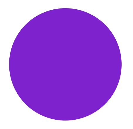
Tailwind
For a simple circle, you use the rounded-full property, which is just a border-radius set to 9999px. Here I’m using the size property, which just sets the width and height to the same value for an equal circle.
<div class="rounded-full bg-purple-700 size-96"></div>
SVG 1
For SVGs we make the width and height 384 to match the pixels in size-96 of tailwind. We use the circle element with cx and cy being the starting position, and r being the radius.
<svg xmlns="http://www.w3.org/2000/svg" width="384" height="384">
  <circle cx="192" cy="192" r="192" fill="#7e22ce" />
</svg>
SVG 2
We can get the same results by just rounding a rectangle. Again, starting positions at x and y, we have to specify the width and height, and we need a radius of at least half the size.
<svg xmlns="http://www.w3.org/2000/svg" width="384" height="384">
  <rect x="0" y="0" width="100%" height="100%" rx="192" fill="#7e22ce" />
</svg>
Stadium
A stadium, or a pill shape, is basically a cut-in-half circle put at the ends of a rectangle.
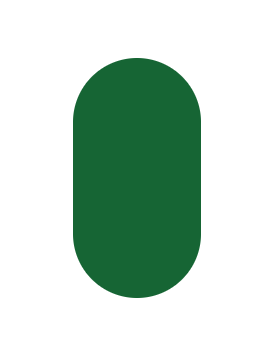
Tailwind
Here we simply take this rounded div, and make the height and width different sizes.
<div class="h-60 w-32 rounded-full bg-green-800"></div>
SVG
Now we use the rect with different width and height. The rx should be half the width for perfectly rounded ends.
<svg xmlns="http://www.w3.org/2000/svg" width="128" height="240">
  <rect x="0" y="0" width="128" height="240" rx="64" fill="#166534" />
</svg>
Ellipse
An ellipse is an elongated circle.
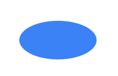
Tailwind
The Tailwind version needs a custom border radius value of 50% / 50%. This sets the x and y curvature to exactly half its value, for a perfect circular shape. We could have equally just inputted what 50% of the values are with rounded-[128px_/_64px].
<div class="bg-blue-500 w-64 h-32 rounded-[50%_/_50%]" ></div>
SVG
The SVG has an element for that. We set the width and height, then use 50% of the values as well.
<svg xmlns="http://www.w3.org/2000/svg" width="256" height="128">
  <ellipse cx="128" cy="64" rx="128" ry="64" fill="#3b82f6" />
</svg>
Or if we want it to scale, in this case our SVG width changes:
<ellipse cx="50%" cy="50%" rx="50%" ry="50%" fill="#3b82f6" />
Triangle
A triangle is a three-sided polygon.
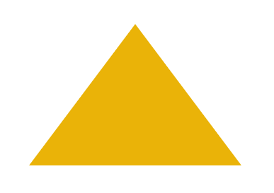
Tailwind
The triangle in CSS is actually just the way a border works in CSS. You’re basically just displaying one of the three border edges. See CSS Triangle and How to Create Triangles in Tailwind.
In this case, we chose the bottom border.
<div class="
  border-l-[150px] border-l-transparent
  border-b-[200px] border-b-yellow-500
  border-r-[150px] border-r-transparent"
></div>
Or you could use the clip-path:polygon property in CSS. Here the input is just groups of connecting dots based on the percentages, unlike in SVG based on the cartesian points.
<div
  class="
    w-[300px]
    h-[200px]
    bg-yellow-500
    [clip-path:polygon(50%_0%,_0%_100%,_100%_100%)]"
></div>
You could also install the tailwind-clip-path plugin, although I’m not sure it saves you much.
<div
  class="
    w-[300px]
    h-[200px]
    bg-yellow-500
    clip-path-polygon-[50%_0%,_0%_100%,_100%_100%]"
></div>
SVG
Now the SVG version uses a polygon. You’re just connecting three points on the plane and filling them in. Again, this is not based on percentages.
<svg width="300" height="200" xmlns="http://www.w3.org/2000/svg">
  <polygon points="0,200 150,0 300,200" fill="#eab308" />
</svg>
Gradient
A gradient is change from one color to another.

Tailwind
Lastly, we can get a gradient easily in Tailwind by using the bg-gradient property.
Note: The Tailwind Conic Gradient Plugin has some cooler effects you can add if you want to go more in depth.
<div class="size-96 bg-gradient-to-r from-blue-800 to-blue-950" />
SVG
Here we define the two colors we want from start to finish in a linearGradient definition, and then insert it in a rect object. While not as straightforward, it gets the exact same pattern done. You can see the power of this if you keep going down the rabbit hole. You should check out the Haikei App if you want to see what SVG can do.
<svg width="384" height="384" xmlns="http://www.w3.org/2000/svg">
  <defs>
    <linearGradient x1="0%" y1="0%" x2="100%" y2="0%">
      <stop offset="0%" stop-color="#1e40af" />
      <stop offset="100%" stop-color="#172554" />
    </linearGradient>
  </defs>
  <rect x="0" y="0" width="100%" height="100%" fill="url(#gradient)" />
</svg>
What Did We Learn?
Not everything is easier in CSS or SVG. It just depends. Some shapes may be better in one or the other, but they both have their blind spots and shining lights. This just scratches the surface of what is possible. Use these patterns with overlap to create something beautiful in your HTML.
This content originally appeared on Telerik Blogs and was authored by Jonathan Gamble