This content originally appeared on TPGi and was authored by Kirby Tucker
Keyboard users rely on focus to understand where they are on the page and what they can interact with. Yet visible focus indicators and logical focus order remain frequent pain points in web development. While these concepts may seem straightforward, applying them in real-world interfaces—especially dynamic ones—can get complex.
In this post, we’ll walk through three key WCAG success criteria related to keyboard focus and explain their practical implications to help you manage focus in a way that supports usability, accessibility, and clarity:
WCAG SC 2.4.7: Focus Visible
“Any keyboard operable user interface has a mode of operation where the keyboard focus indicator is visible.”
The core goal here is simple: sighted keyboard users must be able to see where focus is at all times. Without a visible focus indicator, users are left without crucial context—they can’t tell which component their next keyboard action will interact with.
The focus indicator isn’t just a visual flourish. It shows the user where interactions will happen. In short: if something is interactive and can receive focus, it must have a visible indicator when it does.
Common Mistakes to Avoid
- Removing default browser focus styles without providing a visible alternative
- Using custom components without ensuring they include clear, visible focus indicators
- Allowing focus to land on an element without any visual feedback
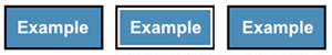
Good Focus Indicator Example
:focus {
    outline: 2px solid #06F;  /* Passes 3:1 contrast on white background */
    outline-offset: 1px;  /* See details in 1.4.11 section */
}
Optional: Use :focus-visible for Hybrid Input Scenarios
It’s not required to have a visible focus indicator for mouse/pointer users, but the WCAG Understanding doc for 2.4.7 suggests it as a best practice.
This is where the :focus-visible pseudo-class comes in. It allows you to show a visible focus indicator only when it is likely needed—such as during keyboard navigation or when using assistive technologies—while suppressing it for standard mouse clicks. This strikes a balance between usability and clarity, especially in hybrid input scenarios or when focus is programmatically set after a user action.
button:focus {
    outline: none;
}
button:focus-visible {
    outline: 2px solid #06F;
    outline-offset: 2px;
}
WCAG SC 2.4.3: Focus Order
“If a Web page can be navigated sequentially and the navigation sequences affect meaning or operation, focusable components receive focus in an order that preserves meaning and operability.”
Focus order is about predictability and logic. When navigating a page with the keyboard (usually via Tab and Shift+
- Reflect the visual layout and logical flow
- Preserve the meaning of the interface
- Avoid skipping over or jumping unpredictably between elements
Only interactive elements should be in the tab order. These include:
- Buttons
- Links
- Form fields
- Custom controls like radio buttons, checkboxes, sliders, menus, switches, etc.
Non-interactive elements (like headings, text, and containers) should not be tabbable—unless focus is being managed temporarily for orientation (see tabindex="-1" below).
Example: Form Buttons
Let’s say you have two buttons at the bottom of a form: “Cancel” and “Submit”. Whether focus lands on Cancel or Submit first is up to you—it doesn’t change the meaning or operation. Ideally, the focus order should match the visual layout, but if it doesn’t in this case, it would not fail this success criterion.
“There may be different orders that reflect logical relationships… Either order may satisfy this Success Criterion”.
— WCAG Understanding 2.4.3

Example: Modal Dialogs
Focus management becomes especially important in modals. When a dialog opens, focus should be programmatically moved inside the dialog. Common valid options include:
- The close button (for quick exit)
- The main heading (to orient the user)
- The first interactive element (e.g., input or button)
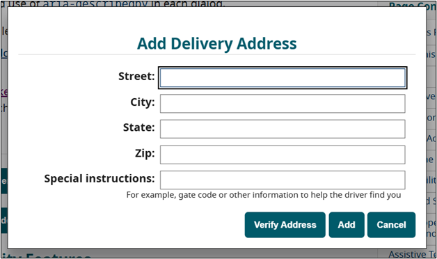
If you set focus to a non-interactive element like the heading, make sure it’s only for orientation—not part of the tab order.
<h2 tabindex="-1" id="dialog-title">Add Delivery Address</h2>
dialog.showModal();
document.getElementById('dialog-title').focus();
Use tabindex="-1" to allow programmatic focus but prevent the element from being part of the keyboard tab order.
Quick Note on tabindex="0" vs tabindex="-1"
tabindex="0"makes an element focusable and places it in the natural tab order.tabindex="-1"makes an element programmatically focusable only. It will not appear in the tab sequence but can receive focus via JavaScript.
Use tabindex="0" for custom components that should be navigated by Tab. Use tabindex="-1" for orientation only, or for custom controls that can be navigated using scripted arrow keys.
Roving tabindex is a pattern used for composite widgets like tablists, menus, or radio groups. In this model, only one item in the group has tabindex="0" at any time (making it focusable via Tab), while the rest have tabindex="-1". As the user navigates with arrow keys, JavaScript dynamically updates which item has tabindex="0" to keep keyboard focus in sync.
Example: Dynamic Interfaces (Pill Lists)
In apps where items are dynamically added or removed (e.g., token or pill lists), you must manage focus intentionally to avoid confusion or disorientation.
Note: A pill list is a UI pattern where selected items (such as names, tags, or email recipients) are displayed as small, sound labels—often with an “X” or remove button inside. You might see this in email clients or message apps, where users add multiple recipients and can remove them as needed.
For example, in a “Send To:” message interface with pill-style recipient tokens, when a user adds a name via a text input and presses Enter or clicks “Add,” the name is added to the list. After that:
- Focus can return to the text input for convenience (if adding multiple names)
- If a name is removed using an “X” button, focus should be moved to the next or previous “X” in the list, ensuring continuity
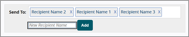
These small decisions can significantly impact usability for keyboard and assistive technology users.
WCAG SC 1.4.11: Non-Text Contrast
“The visual presentation of user interface components and graphical objects has a contrast ratio of at least 3:1 against adjacent color(s).”
This criterion intersects 2.4.7 in a critical way: visible focus indicators must meet contrast requirements. If your outline or highlight is too faint, it fails accessibility – even if it technically exists.
Focus Contrast Scenarios
Outside the component – The outline must contrast with the background behind it.
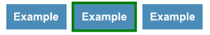
Pass: The external green indicator (#008000) does contrast with the white background (#FFF) which the component is on. It does not need to contrast with both the component background and the component, as visually the effect is that the button is noticeably larger, and it’s not necessary for a user to be able to discern this extra border in isolation. Although this passes non-text contrast, it is not a good indicator unless it is very thick. New in WCAG 2.2: There is a AAA criterion in WCAG 2.2 that addresses this aspect, Focus Appearance.
Inside the component – The indicator must contrast with the component’s fill.
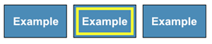
Pass: The internal yellow indicator (#FFFF00) contrasts with the blue button background (#4189B9).
Border-based – Must contrast with both the component and surrounding background.
Pass: An inner border of white contrasts with the black border and the blue component background.
Attribution: The examples and screenshots are sourced directly from W3C’s Understanding Success Criterion 1.4.11: Non-text Contrast and are used for educational purposes.
Good Focus Indicator Contrast
:focus {
    outline: 2px solid #06F;
    outline-offset: 1px;
}
outline-offset adds space between the outline and the edge of the element, helping the focus indicator stand out more clearly against both the component and its surrounding background. This is especially useful when the outline color is similar to the element’s border or background—it increases visual separation and improves clarity.
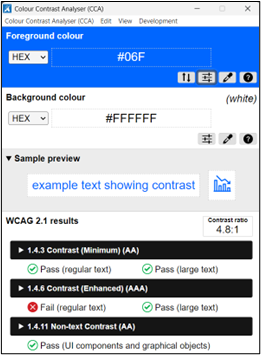
Note: Default browser focus indicators are exempt from contrast requirements under WCAG 2.1 AA. However, once you override those styles, you are responsible for ensuring a minimum contrast ratio of 3:1.
Use tools like TPGi’s Colour Contrast Analyser or browser developer tools to validate your styles.
Focus on Non-Interactive Elements
Sometimes you may want to set focus on a non-interactive element like a heading—for example, when a dialog opens. This is fine for orientation, but follow these two rules:
- Use
tabindex="-1"to allow programmatic focus - Do not apply a visible focus indicator
Visible focus is a cue that something is interactive. Applying it to static elements like headings or paragraphs can confuse users and suggest they’re actionable when they’re not. Think of focus like a keyboard cursor—it should only appear where something can be interacted with or acted upon.
tabindex reminder:
tabindex="0"makes an element focusable and places it in the natural tab order.tabindex="-1"makes an element programmatically focusable only. It will not appear in the tab sequence but can receive focus via JavaScript.
Final Thoughts
Managing keyboard focus is one of the most important—and frequently overlooked—parts of building accessible interfaces. Clear visible focus, a sensible tab order, and strong contrast all work together to support users who navigate without a mouse.
Remember:
- Don’t remove outlines unless you’re replacing them
- Keep focus where users expect it
- Ensure your indicators have enough contrast
- Don’t show focus on non-interactive elements
Accessible focus isn’t just about passing WCAG—it’s about building interfaces that actually work for people.
The post Managing Focus and Visible Focus Indicators: Practical Accessibility Guidance for the Web appeared first on TPGi.
This content originally appeared on TPGi and was authored by Kirby Tucker