This content originally appeared on Telerik Blogs and was authored by Leomaris Reyes
Explored the powerful capabilities of the .NET MAUI Scheduler component from Progress Telerik and some of the many ways to customize it in your app.
We live in a world that moves at a fast pace, and, with it, our learning goals, personal objectives and the need to stay organized evolve just as quickly. However, with so many tasks, commitments and responsibilities, it can sometimes be difficult to keep track of everything.
This is where great opportunities arise: as developers, we can create educational applications that adapt to people’s daily lives and help make things easier.
Imagine an educational app where you just enter your goals, and the app takes care of scheduling, reminding and categorizing them for you. That would be AMAZING!
And that’s exactly why you’re here today: to make the most of available components and explore their life-changing potential when implemented in .NET MAUI applications. In this article, we’ll start by focusing on how to use the Scheduler from Progress Telerik UI for .NET MAUI.
What Is the Scheduler?

It’s a Telerik component that provides customizable and predesigned calendar views. One of its main strengths is how quickly it can be implemented, making it much easier than building a scheduler from scratch.
It allows you to manage dates effortlessly, along with appointments, time rules, special time slots, globalization and localization support, a flexible styling API and much more!
What I love the most is that, to give you more flexibility in the apps you build, the component comes with four built-in views you can easily interact with:
- Day view – Perfect for focusing on what’s happening on a specific date
- Week view – Great for getting a full overview of your week
- Multi-day view – Ideal when you need to track events over a few days
- Month view – Which displays the last 42 days up to the current date, with a clear boundary so you don’t get lost in the calendar
Let’s think about a few scenarios where this could be super useful:
Educational apps are among the top scenarios where this component truly shines. Not only does it save you valuable development time and costs by eliminating the need to build this from scratch, but it also empowers you to focus on what matters most—your app’s unique features.
For example, you could easily build an engaging app that helps children study by setting daily reminders to reinforce their learning at specific times. All while maintaining a polished, consistent design across the entire experience.
Service-based apps are another great example. Think of something like a medical appointment booking app. Using a scheduler like this, your users can easily keep track of their past and upcoming appointments, all in one place. Super handy, right?
How to Implement the .NET MAUI Scheduler
You can implement this in just a few simple steps using the 30-day free trial of Telerik UI for .NET MAUI. First, make sure you have the prerequisites ready:
- Set up your .NET MAUI application.
- Download Telerik UI for .NET MAUI.
- Install Telerik UI for .NET MAUI.
Once you’ve got everything in place, we’re ready to go!
Step 1: Add the Telerik Namespace
Go to your XAML file, and add the following namespace:
xmlns:telerik="http://schemas.telerik.com/2022/xaml/maui"Step 2: Add the RadScheduler to Your XAML
Here’s an example of how to define multiple view options in your scheduler:
<telerik:RadScheduler AutomationId="scheduler" CurrentDate="10/18/2023">
    <telerik:RadScheduler.ViewDefinitions>
    <telerik:WeekViewDefinition />
    <telerik:WeekViewDefinition IsWeekendVisible="False" Title="Work Week" />
    <telerik:MultidayViewDefinition VisibleDays="3" Title="3 Day" />
    <telerik:DayViewDefinition />
    <telerik:MonthViewDefinition />
    </telerik:RadScheduler.ViewDefinitions>
</telerik:RadScheduler>
Step 3: Register Telerik in MauiProgram.cs
Go to your MauiProgram.cs file, and inside the CreateMauiApp method, make sure to register Telerik by adding the .UseTelerik() extension method. It’s recommended to place it above the .UseMauiApp<App>() line, like this:
.UseTelerik()

.UseMauiApp<App>()
And with these simple steps, you have it integrated into your .NET MAUI application!
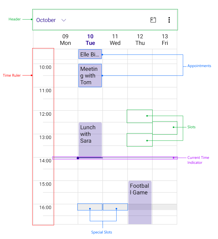
Anatomy of the Scheduler Control
To get the most out of this control, it’s essential to understand its structure and become familiar with each interactive element. This will help you make full use of its capabilities and adapt it to your specific needs.
- Header: Displays the current month and serves as a navigation control for changing views and accessing other dates
- Time Ruler: Serves as the visual representation of time intervals in the Scheduler view
- Current Time Indicator: Indicates the actual time
- Appointment: Visualizes a specific event or task within the timeline of the Scheduler
- Slots: Defines individual time segments as structured by the Time Ruler
- Special Slot: Denotes a marked or highlighted time segment within the Scheduler
Visually, this is how these properties would look:

Image obtained from the official documentation
Let’s explore its features a little further!
 You Can Customize Your Date Formats!
As developer, you probably already know that working with dates can be a real headache sometimes, haha. Most of the time, the issues come from something as simple as the wrong format being used or misinterpreted.
The good news is that with the Scheduler, you can customize the date format based on the type of view you’re using (like day, week or month, as we saw earlier). Each view gives you different parameters you can work with to adjust the format accordingly.
Let’s take a look at how you can set it up for each view type:
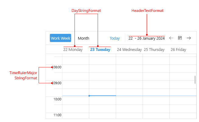
Day, Week and MultiDay Views
You have three key properties you can customize:
- HeaderTextFormat: Allows you to define how the header text is displayed
- DayStringFormat: Specifies the format in which the days are shown in the header
- TimeRulerMajorTickStringFormat: Controls the format of the major intervals in the time ruler
Visually, these properties correspond to the following elements:

Image obtained from the official documentation
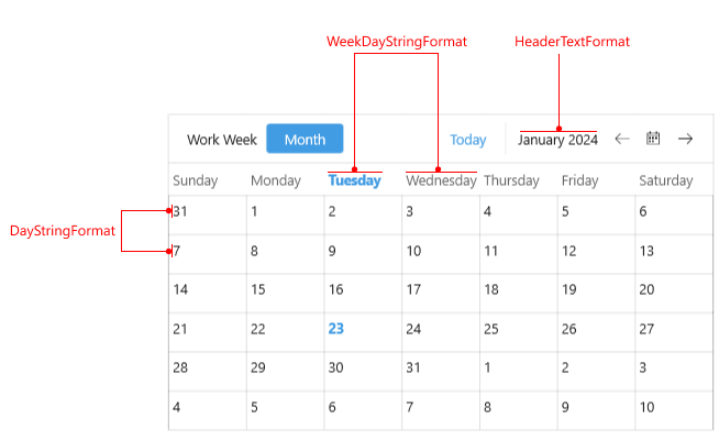
Month View
You also have three key properties you can customize:
- HeaderTextFormat: Allows you to define how the header text is displayed
- DayStringFormat: Specifies the format in which the days are shown in the header
- WeekDayStringFormat: Specifies the format string used to display weekday dates.
Visually, these properties correspond to the following elements:

Image obtained from the official documentation
Implementation
Now that you’re familiar with these properties, implementing them is straightforward.
<telerik:RadScheduler x:Name="scheduler">
    <telerik:RadScheduler.ViewDefinitions>
    <telerik:MultidayViewDefinition HeaderTextFormat="{}{0:ddd, MMM dd}"
    DayStringFormat="{OnIdiom '{0:ddd}', Desktop='{0:ddd d}'}"
    TimeRulerMajorTickStringFormat="{}{0:h:mm tt}"
    TimeRulerWidth="80" />
    <telerik:MonthViewDefinition HeaderTextFormat="{}{0:ddd, MMM dd}"
    DayStringFormat="{}{0:dd}"
    WeekDayStringFormat="{OnIdiom '{0:ddd}', Desktop='{0:MMM - dddd}'}"/>
    </telerik:RadScheduler.ViewDefinitions>
</telerik:RadScheduler>
Conclusion
And that’s a wrap! In just a few minutes, you’ve explored the powerful capabilities of the .NET MAUI Scheduler control by Progress Telerik and everything you can achieve with it. I encourage you to keep exploring and unlocking its full potential in your projects.
Don’t forget that Telerik UI for .NET MAUI comes with a free 30-day trial:
If you have any questions, feel free to leave them in the comments—I’ll be happy to help!
See you next time! 
References
- https://www.telerik.com/maui-ui/scheduler
- https://docs.telerik.com/devtools/maui/controls/scheduler/overview
- https://docs.telerik.com/devtools/maui/controls/scheduler/customdateformats
This content originally appeared on Telerik Blogs and was authored by Leomaris Reyes