This content originally appeared on Telerik Blogs and was authored by Leomaris Reyes
See how the DebugRainbows NuGet Package can help you debug visual disturbances in your .NET MAUI app to help you get to pixel-perfect.
Let’s admit it. At some point in our careers, we’ve encountered something in our UI that isn’t quite right, and our first instinct to “visually debug it” is to slap on a bright red background (or any other eye-catching color). Haha! I’ll be the first to admit—I’ve done it more times than I can count!
But why do we do this? Generally, because we’re trying to locate a UI element that doesn’t look the way we expect. Maybe it’s hidden or has some weird spacing we can’t explain … or it’s just not right for some other mysterious reason.
The good news is that we now have the DebugRainbows NuGet Package, an amazing tool for these cases. It helps us clearly identify all the visual elements of the user interface using colors, without altering the existing visual properties of these elements. Let’s dive in and see what it has to offer!
To facilitate the understanding of this explanation, I will divide it into the following subtopics:
What exactly is the DebugRainbows NuGet Package?
Getting started with DebugRainbows implementation
Supported platforms
What Exactly Is the DebugRainbows NuGet Package?
Debug Rainbows is an open-source library created by Steven Thewissen designed to identify all the visual elements in your application and highlight them with randomly assigned background colors. Additionally, it allows you to add grids to your interface, helping you refine your UI and see that every pixel is precisely where you need it.
But… How does it actually look on my screen?
Below, I’ll show you a screen without the DebugRainbows library and another with it added, so you can see a clear before-and-after comparison.

Getting Started with DebugRainbows Implementation
To achieve a screen like the one we saw earlier, you’ll need to follow a few implementation steps.
Step 1️⃣: Add the Plugin.Maui.DebugRainbows NuGet package to your project.

Step 2️⃣: Go to your MauiProgram.cs file.
In this file, you need to register DebugRainbows with the MauiAppBuilder by adding .UseDebugRainbows(), which will automatically apply rainbow backgrounds by default. Once added, your code should look like this:
using Microsoft.Extensions.Logging;
using Plugin.Maui.DebugRainbows;

namespace RainbowSample
{
    public static class MauiProgram
    {
    public static MauiApp CreateMauiApp()
    {

    var builder = MauiApp.CreateBuilder();
    builder
    .UseMauiApp<App>()
    .UseDebugRainbows() // Line added
    // Add the lines explained later in the session where the Grid is explained.
    .ConfigureFonts(fonts =>
    {
    fonts.AddFont("OpenSans-Regular.ttf", "OpenSansRegular");
    fonts.AddFont("OpenSans-Semibold.ttf", "OpenSansSemibold");
    });

    #if DEBUG
    builder.Logging.AddDebug();
    #endif

    return builder.Build();
    }
    }
}
Your screen should look something like this:

️ At this point, each visual element on your screen is automatically highlighted with a different background, allowing you to easily spot if it’s taking up any unexpected space or if there’s any other information you need to address.
How to Add the Grid to the Screen?
In addition to being able to identify each element as we saw earlier, you can also add a grid over the screen. This grid acts like a digital ruler that you can configure, and it will be very useful for spotting areas that might not have the correct padding/margin, alignment issues and other criteria you need to address.
You can add the grid using the DebugRainbowOptions class. Let’s dive into its properties:
- ShowRainbows: Specifies whether rainbow-colored backgrounds will be applied. It accepts a bool value.
- ShowGrid: Determines whether the grid lines should be displayed. It accepts a bool value.
- HorizontalItemSize and VerticalItemSize: These properties allow you to specify the number of screen units between the horizontal and vertical grid lines, respectively. In other words, they help control the space between the lines, allowing for more precise adjustment of the distance between them.
- MajorGridLineInterval: Sets the interval at which a major grid line is drawn in relation to the minor grid lines. For example, if you set the value to 4, every fourth line will be a major grid line, while the others will be minor lines. Major lines can be easily identified as they are thicker than the minor lines.
- MajorGridLines and MinorGridLines: Defines the style for the major and minor grid lines, respectively. You can customize properties like Color, Opacity and Width for each. These settings are configured through the GridLineOptions class, allowing you to personalize the appearance of both major and minor grid lines.
- GridOrigin: Defines the origin point from which the grid is initially drawn. You can choose between the following values:
- TopLeft: The grid starts at the top-left corner of the screen.
- Center: A major grid line will be placed at the center of the screen, and additional grid lines will be drawn relative to this central line.
Once you’re familiar with these properties, return to Step 2 and locate the code block that says “// Add the lines explained later in the session where the Grid is explained.” There, you can simply add the necessary configuration for your Grid, as shown in the following example:
.UseDebugRainbows()
.UseDebugRainbows(new DebugRainbowsOptions
{
    ShowRainbows = true,
    ShowGrid = true,
    HorizontalItemSize = 20,
    VerticalItemSize = 20,
    MajorGridLineInterval = 10,
    MajorGridLines = new GridLineOptions { Color = Color.FromRgb(255, 0, 0), Opacity = 1, Width = 4 },
    MinorGridLines = new GridLineOptions { Color = Color.FromRgb(255, 0, 0), Opacity = 1, Width = 1 },
    GridOrigin = DebugGridOrigin.TopLeft,
})
And you will have a result like the following:

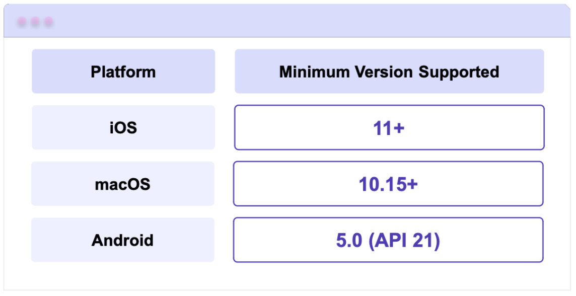
Supported Platforms
Finally, here are the minimum versions supported for each platform to work with this amazing NuGet package.
References
This article was based on the official documentation:
This content originally appeared on Telerik Blogs and was authored by Leomaris Reyes