This content originally appeared on Level Up Coding – Medium and was authored by Ogechi Anoliefo
Exploratory Data Analysis (EDA) and Segmentation of bank customers into different groups

Customer segmentation is performed by businesses to classify their customers into various groups based on similar characteristics. These businesses can then create more personalized services that resonate with each group of customers, ultimately leading to increased customer satisfaction.
Different clustering techniques can be used to carry out customer segmentation. This article explains the steps in which I used a popular unsupervised machine learning technique, K-Means clustering, to carry out customer segmentation of a bank’s customers using a sample bank transaction dataset. In addition to customer segmentation, I performed some Exploratory Data Analysis (EDA) on the data, which I also summarized in this write-up.
Project Approach
The steps used to carry out this project are shown in the flow diagram below.

Imports
I started by importing the python libraries and dataset to be used. Some of the libraries used include Pandas (for manipulating and cleaning dataframes), GeoPandas (for working with geospatial data), Ngram (for use in spelling correction — to retrieve the correct spellings for locations — which is discussed in detail later), Scikit-Learn (for use in building the clustering model), Matplotlib & Plotly (for data visualization). To see all the libraries I used in this exercise, take a look at the full list in my Google Colab Notebook here.
The dataset used for this exercise is a public bank transaction dataset on Kaggle, containing over 1 million transactions by a bank’s customers from August to October 2016. The bank in question is an unnamed Indian bank and all customer Personal Identifiers (PIDs) have been taken out from the dataset. The dataset can be found here.
Data Cleaning
To clean the dataset, I eliminated duplicate entries and entries with missing values, changed the columns to their appropriate data types, handled outliers, added calculated columns, dropped irrelevant columns, renamed some columns. To see how I tackled each of these steps in detail, take a look at my Google Colab Notebook here. At the end of the data cleaning step there were 985,322 entries left in the dataset. See the screenshot below showing the columns present in my dataset after the data cleaning step.

Exploratory Data Analysis (EDA)
For the EDA of this project, I did an extensive analysis. It was divided into seven parts which I will explain briefly below:
Distribution of transactions by hour of day: Here, I performed calculations and created visualizations to look at the total and average number of transactions per hour of day, in order to check for any daily transaction time trends. Both visualizations showed that 8:00 pm to 9:00 pm was the hour of day when the most number of transactions were carried out. It was also discovered that 4:00 pm to 10:00 pm was the peak period for daily transactions, while 1:00 am to 6:00 am was the off-peak period. To view the code used for my analysis, and the visualizations created, see my Google Colab Notebook here.
Distribution of transactions by day of week: After identifying daily transaction trends, I proceeded to check for weekly transaction trends. From this analysis, it was discovered that the day of the week with the highest number of transactions was Saturday, while the day of the week with the fewest transactions was Tuesday.
Age distribution of customers: This was to look at the age distribution of the bank’s customers. The analysis showed that most of the bank’s customers were between the ages of 20 and 50.
Age by Transaction Amount and Account Balance: This analysis was done to find out if there was any correlation between customer age and either transaction amount or account balance. The scatter plots created showed no correlation between either pair.
Gender distribution of customers: This was to view the gender distribution of the bank’s customers. The analysis showed that about 72% of the bank’s customers were male, while the remaining were female.
Gender by Transaction Amount and Account Balance: This was to find out if there was any correlation between customer gender and either transaction amount or account balance. The box plots created showed no correlation between either pair.
Location-wise Analysis:
This is the only EDA step I will explain in detail, as I utilized many concepts to carry out this step.
The aim of the location analysis was to create maps to visualize the bank’s state-wise prominence across the country, and to spot any useful regional trends in India.
The location column in the dataset contained very inconsistent data. Most entries contained the Indian district where the customer resided, some contained the sub-district (tehsil) alone, some contained the customer’s full address (including house number, street and district), while some contained only the state/union territory. To be able to create maps showing data for the different states, I had to roll up each customer location to the state level, i.e., I had to return the corresponding state for each customer location.
To get the appropriate state for each location, I used a shapefile of India containing all states, districts and tehsils (sub-districts). First, I had to return the correct spelling for each location, the way it appeared in the shapefile, so that I would be able to return the corresponding state.
To return the correct spelling for each location, I used Python’s Ngram to search the shapefile and obtain the correct spelling.
A brief explanation on how the python Ngram library works for spelling corrections: Have you ever wondered how spell checkers in word processors work? For example, the spell checker in Microsoft Word? Spell checkers compare misspelt words in your text to an accepted database of correct spellings, and suggest corrections based on the most similar correct spellings. This is the same principle in which Ngram works when used for spelling corrections.
Ngram searches a database of words to find the exact or closest match to a selected word. To use Ngram, you will need to provide the database containing the correct spellings, where the program would search. While searching, Ngram will calculate the similarity coefficient between the selected word and other words in the database, and if its find() function is used, it will return the word from the database with the highest similarity coefficient.
In my case, the location columns in the shapefile contained the correctly spelt locations, so I created databases with these columns to serve as the search databases for Ngram. I wrote a function that uses Ngram to search and return the closest match for each misspelt location in the dataset.
Take a look at the function I created below.
Below is a screenshot showing the head of my dataset after retrieving the correctly spelt locations.

Once I had retrieved the correctly spelt locations, I created a function to return the corresponding state for each location. The function was written such that, for locations that were districts or tehsils, it would search through the district or tehsil column of the shapefile and return the corresponding Indian state for that location. For entries where the location was already a state, the function would directly return the location. View the function below:
This is what the first few entries of the ‘State’ column looked like after I had retrieved the corresponding state for each location:

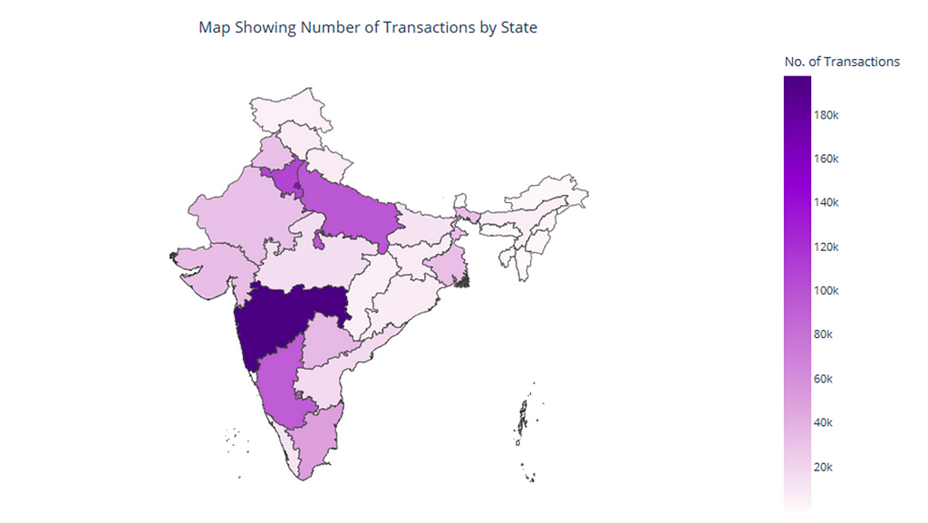
After aggregating the locations to state level, I proceeded to create maps to explore potential regional trends within India. For my analysis, I focused on three maps:
- a map of Transactions by State — to view the number of bank transactions per state within the period. View the map that was created using Plotly in python below.
- a map of Customers by State — to view the number of bank customers per state. View the map that was created using Plotly in python below.

- a map of the bank’s Penetration by State (i.e. the % ratio of number of customers in a state, to population in the state) — to look at the bank’s dominance across the various states. View the map that was created using Plotly in python below.

From the maps above, it can be seen that some states and territories like Maharastra, NCT of Delhi, Karnataka, Uttar Pradesh, Haryana were the locations where the bank had the most customers and transactions. On the other hand, Mizoram, Meghalaya, Nagaland, Sikkim were the states having the least number of customers and transactions.
Recommendations from EDA
Daily Transaction Times: Since the daily peak period for transactions is between 4pm and 10pm, and the daily off-peak period is between 1am and 6am, scalability of the bank’s resources would be a good approach in this situation. During peak periods, the bank could scale up their server capacity, network bandwidth, database resources, etc to ensure optimal performance and meet customer demands. Conversely, during off-peak periods, the server capacity, network bandwidth, and database resources could be scaled down to save resources and reduce costs.
The bank could also tailor marketing campaigns to coincide with peak hours. For example, promoting credit card offers, loan products, or investment services during these times, as special promotions during peak hours could attract more customers and boost revenue.
Age distribution of customers: A large chunk of the bank’s customers are between the ages of 20 and 50. Using this information, the bank could engage in customized product offerings to suit the different age groups. For example, with loan offerings, the bank could offer student loans for Gen Z, home loans for millennials, and retirement loans for older customers.
On the other hand, to attract older aged customers above 50, the bank could offer products and services that resonate with seniors, such as retirement and financial management plans. These services could be advertised via platforms and strategies that appeal to an older demographic such as Facebook, email marketing, traditional media. Any sign-up requirements should be kept to the minimum in order to avoid loss of interest. The bank should also ensure that their physical branches are easily accessible by seniors. To retain these older customers, dedicated relationship managers who understand their financial goals could be assigned to provide tailored advice. Also, regular check-ins and personalized communication to this age group of customers could foster their trust and loyalty.
Gender distribution of customers: The bank is dominated by male customers, representing a whooping 72% of its customer base, while female customers comprise the remaining 28%. As the transaction data in the dataset was collected in 2016, one of the reasons for this gender disparity could be deep-rooted cultural norms and traditions in India, that leave women less involved in financial matters.
To attract more female customers, the bank could create specialized financial products and services designed specifically for women, for example, women-targeted loans for working capital and investments.
Location-wise analysis: From the EDA, the bank has a presence in all Indian states/union territories. NCT of Delhi was the state/union territory where the bank had the highest penetration (about 0.86%), which was not surprising because it’s the country’s capital. However, there were some states that had relatively low penetration, eg. Bihar and Odisha (with a penetration of about 0.01%). In order to expand the bank’s footprint in states with low penetration and low customer count, the bank could consider establishing physical branches in these states and participating actively in local events. For remote areas where setting up branches may not be feasible, the bank could channel more effort into advertising their digital payment solutions and encourage customers to use mobile banking apps, online transfers, and contactless payment methods. The bank could also customize banking services to meet the specific needs of local communities in these areas. For instance, if a state has a large agricultural sector, the bank could offer specialized loans for farmers. This will likely encourage or entice potential customers. Additionally, the bank may also choose to partner with fintech companies to offer innovative services and expand their digital footprint.
Customer Segmentation
To classify the bank’s customers into different groups based on similar characteristics, I used K-means clustering technique. The K-means algorithm would group the bank’s customers such that customers with similar attributes are in the same cluster. To learn more about K-means clustering technique, see here.
Before carrying out clustering on my dataset, I had to preprocess the data to make it ready for clustering. First, I dropped the columns which were not going to provide any useful cluster information, as I was not going to pass them to the clustering algorithm. I dropped all columns except Gender, Age, Transaction Amount and Account Balance; these were the columns I intended to use for clustering.
I proceeded to encode the categorical features and standardize the numerical features. For the categorical features, I performed one-hot encoding using pandas’ get_dummies() function, to give them dummy numerical values. For the numerical features, I used scikit-learn’s StandardScaler to standardize them in order to have comparable scales.
After preprocessing the data for clustering, below is a screenshot showing the head of the dataset that was passed to the clustering model.
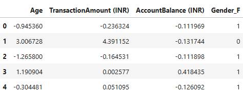
You may have noticed that the column Gender_M is missing from the screenshot above. Since the values for gender can be inferred from each other (i.e. if Gender_F is 0, then Gender_M will be 1, and vice versa), I decided to drop one of the gender variables; so I dropped Gender_M. This was because there was no need to keep the variable anymore.
Building the K-Means Clustering Model:
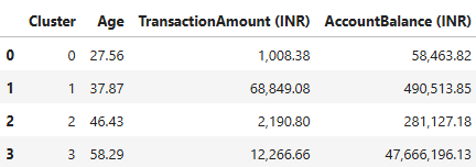
To build the K-Means clustering model, I had to determine the optimal number of clusters that would be needed to best group the customers. I determined this using the elbow method and further validated this using KneeLocator to get the optimal elbow point in the elbow curve. The optimal number of clusters was determined to be 4.
With this, I went ahead to build the model, setting the number of clusters to 4. After clustering was done, each of the bank’s customers was assigned to one of four clusters: 0, 1, 2, 3.
To determine the characteristics peculiar to customers in each cluster, I computed the average of all variables across each cluster. A screenshot showing these values is shown below:
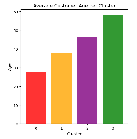
To interpret the clusters more easily, I created visualizations showing the different customer attributes per cluster. Some of the visualizations can be seen below:


Main Attributes of each Cluster:
Cluster 0: Low transaction amount, low account balance. Mean age is about 28.
Cluster 1: High transaction amount, high account balance. Mean age is about 38.
Cluster 2: Low transaction amount, high account balance. Mean age is about 46.
Cluster 3: Average transaction amount, very high account balance. Mean age is about 58.
After interpreting the attributes of each cluster, I went ahead to build personas around them. The following are the customer personas I built based on the clusters created:
Cluster 0 — The first jobbers
This segment is made up of a younger age group. The individuals in this segment have low transaction amounts and low account balances.
They are most likely first or second jobbers.
Recommmendation: Promote discounts/promos to these individuals. Since they do not earn as much money, they are likely to be enticed by discounts where they can use their bank cards to purchase items or services for a fraction of the price.
Clutser 1 — Middle-class parents with lots of responsibilities
These individuals are in their late 30s. They are the customers with the highest transaction amounts compared to all other segments. They also have high account balances. They are most likely parents with a lot of responsibilities, hence their high transaction amounts. They have also likely been able to work for some years and save up some money to start their families, hence their high account balances.
Recommendation: Promote mortgage services to these individuals as they probably have young families and may be open to securing their own homes. It is also a good idea to promote healthcare plans to these individuals as they are likely to be parents looking after a number of children.
Cluster 2 — The frugal spenders
This segment is made up of middle-aged individuals. The individuals in this group are frugal spenders, having low transaction amounts, but average to high account balances.
Recommendation: Promote savings plan rewards to these customers. They will likely be willing to sign up for special savings plans where they get to save up to a specific amount of money, and get rewarded via periodic prize draws, higher interest rates, etc. Also promote discounts/promos to these individuals as they will likely be willing to take part in promos where they can use their bank cards to purchase items or services for a fraction of the price.
Cluster 3 — The highly affluent individuals
This segment consists of a select few customers with very high account balances. These customers are likely individuals who have worked very hard to amass a significant amount of wealth. Customers in this segment are close to retirement age and they have average transaction amounts, i.e., they do not overspend.
Recommendation: Since the individuals in this group are around retirement age, promote pension plans and other retirement packages to these individuals if available. Also, healthcare plans and mortgage services should be promoted to customers in this segment.
Conclusion
This article summarized the steps which I used to perform EDA on a bank’s transaction data, and cluster the bank’s customers into various groups. It explored insights drawn from the data and suggested recommendations for the bank to provide personalized services as well as boost their revenue.
As always, thank you for reading my article. For any questions or remarks, please leave a comment. The complete Python code used for this project can be seen in my Google Colab Notebook.
EDA and Bank Customer Segmentation using K-Means Clustering Technique was originally published in Level Up Coding on Medium, where people are continuing the conversation by highlighting and responding to this story.
This content originally appeared on Level Up Coding – Medium and was authored by Ogechi Anoliefo